Tales from the American West: The Rees-Jones Collection

Tales from the American West: The Rees-Jones Collection came to the Amon Carter Museum in Fort Worth in early September of 2015 and runs until February 21st. Trevor Rees-Jones is a Dallas collector who became interested in art when he visited the Amon Carter as a child (called the Amon Carter Museum of Western Art at the time); how fitting that his wonderful collection of art from the American West is now being exhibited to the public for the first time at the very museum that inspired him. 

0
0
1
12
74
Signet Art
1
1
85
14.0


Normal
0


false
false
false

EN-US
JA
X-NONE


 <w:LatentStyles DefLockedState="false" DefUnhideWhenUsed="true"
DefSemiHidden="true" DefQFormat="false" D…

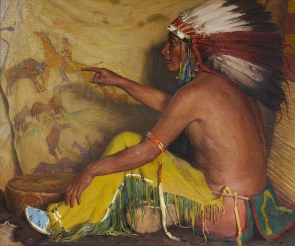
“Pointing with Pride to His Record, 1924,” Joseph Henry Sharp, Rees-Jones Collection

Rees-Jones (b. 1951) is a philanthropist and attorney who grew up in Texas and is best known as the founder and chairman of Chief Oil and Gas.  His collection consists of 19th and 20th Century paintings, watercolors, sculptures and prints of the American West from well-known western artists like Frederic Remington and Charles M. Russell, as well as E. I. Couse, Henry Farny, Thomas Moran, and others.  With landscapes, portraits, action scenes on the frontier, and portrayals of the everyday, Tales from the American West really does encapsulate a view of the great American West.

0
0
1
14
85
Signet Art
1
1
98
14.0


Normal
0


false
false
false

EN-US
JA
X-NONE


 <w:LatentStyles DefLockedState="false" DefUnhideWhenUsed="true"
DefSemiHidden="true" DefQFormat="false" D…

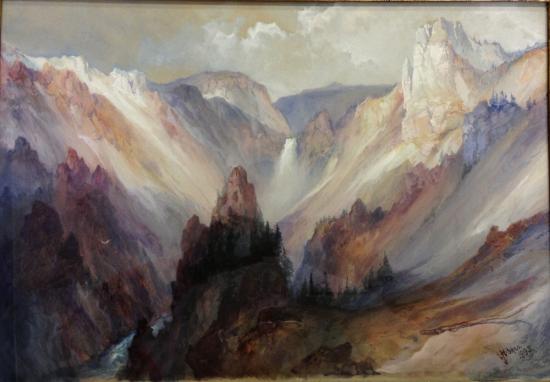
“Grand Canyon of the Yellowstone, 1895,” Thomas Moran. Watercolor on paper, Rees-Jones Collection

Within the exhibition is a set of nine Henry F. Farny (1847-1916) paintings and watercolor works.  The French born and European trained artist started off as an illustrator for children’s books and magazines.  When his family emigrated from France to the United States in 1853, settling in Pennsylvania, Farny became enthralled with the Indians at a Seneca reservation near his home.  Later, in 1859, his family moved to Cincinnati, and there in the west is where Farny found the subject matter that would alter his career. 

These Farny works are a display of the artist’s infatuation with the American Indian, often displaying several figures within a sprawling landscape, and a representation of his mastery of the watercolor medium.  Opaque watercolor is notoriously difficult to work with, and the amount of detail that can be seen – repeating patterns, delicate vegetation and rock formation, facial features – is really astounding.

The piece “Protecting the Emigrants, 1906” by Charles Schreyvogel is on display in the exhibition. It is an action scene on the often-dangerous plains; three cowboys on horseback fire back towards the viewer as they retreat, gun smoke and dust flying in the air.  Schreyvogel was a self-taught painter who grew up in New York with his poor immigrant family.  In the late 1800’s he made several trips to the western territories to collect Indian artifacts and study the land.  His work is often compared to the action scenes of Frederic Remington.

0
0
1
11
64
Signet Art
1
1
74
14.0


Normal
0


false
false
false

EN-US
JA
X-NONE


 <w:LatentStyles DefLockedState="false" DefUnhideWhenUsed="true"
DefSemiHidden="true" DefQFormat="false" D…

"Protecting the Emigrants, 1906” Charles Schreyvogel, Rees-Jones Collection

Rees-Jones began his collection in 2007.  Since then, the collection has grown to over 23,000 items; everything from original works by revered western artists, to rare books, photography and maps make up the still growing assemblage of artifacts of Western Americana.  Tales from the American West: The Rees-Jones Collection is just a peek into the mammoth high-quality collection, and even though the exhibition is a small assortment of pieces gathered through a love of accumulating works from a treasured era, the exhibition manages to capture the atmosphere and legacy of the American West.  My only complaint is that there wasn’t more to see.

0
0
1
11
68
Signet Art
1
1
78
14.0


Normal
0


false
false
false

EN-US
JA
X-NONE


 <w:LatentStyles DefLockedState="false" DefUnhideWhenUsed="true"
DefSemiHidden="true" DefQFormat="false" D…

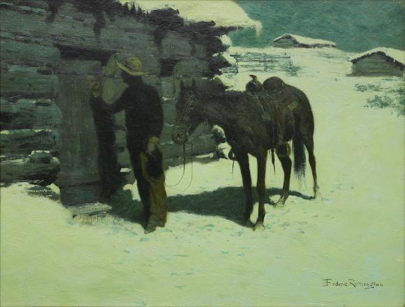
“The Belated Traveler, 1905–06,” Frederic S. Remington, Rees-Jones Collection

The strategically curated show propels the viewer into a different time period, an all-but-forgotten America.  This is a great show in our own backyard, and it leaves on the 21st of next month.  As always, every show at the Amon Carter is free; don’t miss this one.  

-M.P. Callender


Kehinde Wiley: A New Republic

Kehinde Wiley: A New Republic, currently on display at the Modern Museum of Art in Fort Worth, highlights the artist’s fruitful 14-year career.  Every body of work, a snapshot from each series, is represented within the exhibition to give the viewer a comprehensive walk through Wiley’s oeuvre, thus far.

Kehinde Wiley (b. 1977) is fascinated with the intimacy of the portrait.  Anyone unfamiliar with his work quickly learns the artist is enamored with the portrayal of the human form, of another person depicted within an artwork as the focus; so enamored, in fact, he has spent the entirety of his efforts as a working artist on it.  His work questions the power of the sitter, the individual the viewer observes, oftentimes standing on the shoulders of history as he smartly appropriates work from the masters like Manet, Van Dyck and Titian, removing the recognizable historic figure and replacing it with a contemporary sitter – young men and women of color in fashionable clothes.  This became Wiley’s signature style as he was artist in residence at the Studio Museum in Harlem, New York. 

0
0
1
8
49
Signet Art
1
1
56
14.0


Normal
0


false
false
false

EN-US
JA
X-NONE


 <w:LatentStyles DefLockedState="false" DefUnhideWhenUsed="true"
DefSemiHidden="true" DefQFormat="false" DefPriori…

"Napoleon Leading the Army over the Alps", Brooklyn Museum

Wiley is taking models of color from all over the world in their ordinary clothes and elevating them to a position of power by painting them in a classical style, creating an appeal for both the high art connoisseur and those who are not involved in the art world; his references are recognized in both spectrums.  Besides one large portrait of Michael Jackson (an appropriated image of “Equestrian Portrait of King Philip II, 1628,” by Paul Ruben) all of Wiley’s subjects are unknowns.  They are not presidents, royalty, or war heroes; they are the urban youth, many of whom Wiley finds on the street. 

0
0
1
16
92
Signet Art
1
1
107
14.0


Normal
0


false
false
false

EN-US
JA
X-NONE


 <w:LatentStyles DefLockedState="false" DefUnhideWhenUsed="true"
DefSemiHidden="true" DefQFormat="false" DefPrio…

"Anthony of Padua" Seattle Art Museum / "Princess Victoire of Saxe-Coburg-Gotha" 

The paintings, the majority of them very large works on canvas, are a collision of the photo-realistic subject and the painstakingly detailed background.  The backgrounds, either repeating colorful patterns or vast landscapes, are largely done by Wiley’s studio assistants, a trend that points back to the practices of the Renaissance that has become increasingly regular with modern artists and their studios.  Stained-glass windows, 14-carat gold icons, and bronze portrait bust works also display how young people around the world are existing in their space. 

"St. Gregory Palamas" Collection of Edward Tyler Nahem, New York / "Houdon Paul-Louis" Brooklyn Museum / "Saint Remi"&nbsp;Galerie Daniel Templon, Paris

"St. Gregory Palamas" Collection of Edward Tyler Nahem, New York / "Houdon Paul-Louis" Brooklyn Museum / "Saint Remi" Galerie Daniel Templon, Paris

A New Republic begins with Wiley’s early works, the paintings focusing on African American men in Harlem.   The exhibition then pulls the audience through the artist’s exploration of the portrait and what it can do as he explores its history and traditions within culture. The exhibition illustrates that Kehinde Wiley’s body of work is more than simply a contemporary amalgamation of no-name models and historic painting techniques.  Upon initial view the pieces are large, colorful, bright, and engaging, but Wiley’s paintings do more than please the eye and decorate a space.  As the viewer looks for what is actually happening on the canvas, the artworks reflect issues of race and inequality in contemporary society, they question authority, nobility and stature, they deal with gender roles and fashion. 

The exhibition invites the audience to question what each portrait has to say and what the portrait as a painting approach can accomplish.  It is a fantastic show and we highly recommend seeing it.  Better hurry, this one leaves the Modern this weekend!

-M.P. Callender

Gustave Caillebotte: The Painter's Eye

Gustave Caillebotte: The Painter's Eye is currently showing at the Kimbell Art Museum in Fort Worth.  The Kimbell is no stranger to exhibiting works by masters of the Impressionist movement; pieces by artists like Degas, Renoir, Cezanne, Monet and Pissarro have been on display and are in the museum’s permanent collection.  With The Painter’s Eye, which opened in November and runs until February 14th, the curators Mary Morton (National Gallery, Washington, D.C.) and George T.M. Shackelford (Kimbell), show the very best work of the lesser known Impressionist Gustave Caillebotte (1848-1894). 

Gustave Caillebotte (pronounced kai-yah-bott) was born into an upper class family and because of the support from his family’s investments, selling his artwork was neither a necessity nor a motivator as it was for the other Impressionists.  Although he was a great champion and patron of the movement, he has been coined the lesser-known Impressionist because the majority of his life is a mystery; he didn’t leave behind any legers or journals, though there are letters, and he died at 45. 

"Paris Street; Rainy Day" The Kimbell Art Museum / Art Institute of Chicago image

"Paris Street; Rainy Day" The Kimbell Art Museum / Art Institute of Chicago image

Arguably his most famous work “Paris Street; Rainy Day (1877),” is owned by the Chicago Art Institute, and people recognize it as an iconic piece but rarely know who painted it.  It is an encapsulating piece for the artist; cropped subjects much like a photograph, the utilization of geometric lines to pull the viewer’s eye into the scene and across the canvas, a view of bustling Paris. 

The Painter’s Eye sets out to highlight the importance of Caillebotte’s work, focusing on the years Caillebotte was most connected with the Impressionists, the period between 1875 and 1882.  The show is organized by subject or series, “River Views,” “Suburban Views,” “Looking Out,” “Looking In;” each propelling the audience’s gaze where Caillebotte wanted it, taking them to a Parisian boulevard, a quiet and tension filled luncheon, or a game of bezique. 

"Gateaux"/ "Fruit Displayed on a Stand"&nbsp; 
 
0
0
1
10
61
Signet Art
1
1
70
14.0


Normal
0


false
false
false

EN-US
JA
X-NONE


 <w:LatentStyles DefLockedState="false" DefUnhideWhenUsed="true"
D…

"Gateaux"/ "Fruit Displayed on a Stand"  Museum of Fine Arts, Boston, Massachusetts

My personal favorite was the still life section.  While not the highlight of Caillebotte’s work or any Impressionist’s for that matter, though they all did still life paintings, these pieces were both beautiful and rough.  There were depictions of fruits on a stand at market, sugary sweets in bright colors aligned on a table (something that looked like a 19th Century Wayne Thiebaud) and there were works with ducks hanging and butcher shop meats; a great juxtaposition of subject matter done with the beautiful commingling hand of Caillebotte, one where Realism continues to blur and morph into the Impressionistic. 

"The Floor Scrapers"&nbsp;Musée d'Orsay, Paris

"The Floor Scrapers" Musée d'Orsay, Paris

“The Floor Scrapers,” is another show stealer.  It is Caillebotte’s first major work that he submitted to the academic Salon, which turned down the work.  It is an image of three bare-chested workers on their knees scraping the varnish off the wood floor of a room.  The rejection of this piece led Caillebotte to turn to the Impressionists, who welcomed him into their circle. 

Though The Painter's Eye will not heave Gustave Caillebotte into the ranks of the household name Impressionists, it is a fantastic show that puts the spotlight on an underappreciated and very talented artist with the exhibition of some wonderful paintings.  This is a show worth seeing. 

-M.P. Callender


Seventh Annual Dallas Art Fair

For the past seven years art enthusiasts, collectors, advisors and dealers have headed to the Dallas Art Fair, and for good reason.  The fair attracts galleries internationally (Hong Kong, Tokyo, Rome, Zurich…), galleries here in the U.S. (New York, Santa Fe, Los Angeles, San Francisco...), and those right here in Texas (Dallas, Houston, Fort Worth, Marfa).  This year the Fashion Industry Gallery in Dallas’ Downtown Arts District was filled to the gills with over 95 galleries exhibiting, twenty more than last year.

As I walk through the aisles of the fair each year, I try to be aware of what has changed from the year prior.  I try to notice trends and see if galleries are pushing a particular artist more than last year; to see if certain mediums are becoming more desirable and collected more, to find out the ol’ what’s hot and what’s not.

A large number of works shown were on reflective surfaces, either mirrors or aluminum – a substrate that allowed some sort of reflection of the viewer.  The piece by American artist Jill Magdid, “Security Measures: Pay Attention to Who is Directly in Front of You,” is a great example.  She is represented by RaebervonStenglin, Zurich, here is the gallery’s image of the work.

Magdid.jpg

And here is the picture I took.

IMG_6754.jpg

I took a picture from the far left to avoid being in the shot, but…it’s a mirror.  You can’t avoid being a part of the work. The viewer cannot experience the work without being in it; even the attempt of avoiding your reflection in the work is informing your participation with it and is answering the question the piece has in bright red letters along the bottom, no doubt.  “Pay Attention to Who is Directly in Front of You”

New York artist Rashid Johnson, represented by Massimo De Carlo, Milan/London, had one of his large mirrored pieces showing as well.  Again, we are engaging the artwork as part of it.  The mirror reflects the physical image, and with it the perceptions of ones self and the perception of self, a simultaneous interaction as we view and consider the piece.

Bertrand Lavier, also from Massimo De Carlo, had a 49 x 49” Acrylic gel on dibond on wood piece on display.  The artist’s gesture and movement through the clear acrylic gel distorts the viewer’s image as they observe, changing the perception as one engages the work. 

There was also the work of Korean artist Chul Hyun Ahn with C. Grimaldis Gallery, Maryland, who has shown at the fair the past several years with great success.  People really enjoy his neon and mirror works that seem to break dimensions and the illusion of space as he questions and explores the gap between the conscious and subconscious. 

Pieces with reflective surfaces, though of interest and worth note, do not qualify as a trend.  The trend this year, and a trend I think we will continue to see coming strong, is new-media.

Artworks created with or in some way dealing with new media technologies were more prevalent this year at the fair than any year prior.  New media is on the rise, in popularity, acceptance and collectability.

Matthew Plummer-Fernandez’s 3D printed sculptures were great.  The Zhulong Gallery, Dallas, artist 3D scans everyday items using a digital camera.  The images are then subjected to algorithms that abstract and change them into new forms. Sometimes the pieces come out looking like something recognizable, like the watering pot, and other times the viewer is unable to trace the piece back to something tangible. According to Plummer-Fernandez, “Vessels are arguably the lowest common denominator for man-made objects across all cultures, these objects however have no storage function other than to embody the stored digital data that describes them.”

They are very interesting pieces constructed through a new process, one that brings into consideration the importance and value of the artist’s hand involved in a work.  The discussion here, the shift from hand-thrown and fired ceramics to digital printing with plaster and a bonding agent, is the same that stretched the art world’s definition and mentality of original art when photography was on the rise as an art form; it is the same with the artists who have a fully staffed workshop to complete their works for them.  The importance of an artist’s involvement with a work of art, whether as overseer or doer, is at question and is presented for discussion to the audience in small machine made sculptures. 

Plummer-Fernandez also had a video instillation on display called, “We met Heads On.”

Hosfelt Gallery, San Francisco, had several new media pieces showing by California artist Jim Campbell.  According to Hosfelt, “Campbell uses technologies developed for information transfer and storage to explore human perception and memory.”

What was really engaging about these works (“Topography Reconstruction (wave), 2014,” shown above) was the three-dimensional format.  Instead of having the piece just loop on a screen, on a two-dimensional plane, Campbell has constructed a new format to engage his audience. 

IMG_6737.jpg

Alexandra Gorczynski of Zhulong Gallery, Dallas, had her work “Chronotape 1” on display.  It was a very engaging piece.  In her work she embeds video into images of ancient sculptures. It's smart and intriguing, juxtaposing an image having art historical weight with contemporary streaming video.  

All of these new media pieces mentioned solved the one thing that always puzzled me about the art category (installation works, earth works and the like); collectability.  The majority of new media work I’d seen in the past I couldn’t see being successfully exhibited anywhere besides a gallery or museum. Each of these works I could see in a home or office space on display, serving its purpose and intent. 

Some of my favorites from the show:

Kirk Hopper Fine Art, Dallas had several mixed media steel and glass works by well-known Texas based artist James Magee on display. 

Carlos Cruz-Diez, Sciardi Gallery, Houston, chromography on aluminum works, "Physichromie Pan Am 123, 2013," and "Physichromie Pan Am 60, 2013"

“Spring Flowers at night,” Talley Dunn Gallery, Dallas and “Still Life with Oranges,” DC Moore Gallery, New York by Texas artist, David Bates.

A few works by Gallery Henoch, New York, artists: Janet Rickus, Steve Smulka, Robert Jackson and Eric Zener

As with every year, I saw several sold stickers on works throughout the galleries.  I was even able to congratulate and talk with a dealer early on Friday who had completely sold out on Thursday during the preview gala. 

The Dallas Art Fair is one of the very best shows in contemporary art, and if it keeps this pace, it’s only going to get bigger.  It is a privilege for Dallas to have such a great annual showing of contemporary art from all over, a show that engages a local audience for contemporary art, and one that will likely drive the local contemporary art market.

-M.P. Callender

Hans Hofmann: Catalogue Raisonne of Paintings - A Review

The very first thing I did when I dragged the 20+ pound box inside and opened it up was to look for the three Hans Hoffmann paintings I had recently appraised for various clients.  I am always curious if there is new information on an item I have appraised and just wanted to make sure these three pieces had been included in this brand new catalogue raisonné.  I knew the dates of each and the catalogue raisonné is listed chronologically.  So I thought that would be the quickest approach.  Whoops!  Violated my own first rule of referencing a catalogue raisonné-always check the “How to Use This Book” section.  After several minutes of confusion and only finding one of the three in the CR, I turned to Volume I (of III) and began at the beginning.  This is where I found that the two items not listed in the catalogue raisonné were not there because they did not meet the authors’ definition of “painting.”   Hofmann was very prolific during his career.  The CR editors determined that in order to deal with an manageable number, they would define the term “painting” for the purposes of this catalogue as: “oil or casein, possibly with additional elements of gouache or ink applied to a support of canvas, wooden panel or board.”  This left a group of just over 1,700 items and excluded the 3,500 known works on paper.   Since two of my group of three items were watercolor on paper, they had not been included.   Oh well, lesson learned.   The fact that two of my items were not included was not because they had been in private hands and were unaware of the compilation of a CR.  They were not excluded because the authors thought them inauthentic.  They were just considered works on paper and as such were in a category left for the next ambitious project.   Lesson # 1 Review: Check the “How to Use this Book” section and understand what items are covered. 

I have written often of catalogues raisonné.   As an appraiser, I have collected and used CRs for many different artists, and, since CRs generally cover only one medium, I own several different ones for many individual artists.  For those who have not run into this term, a catalogue raisonné is an attempt at an encyclopedic reference source on everything produced by a given artist in a given medium.  A CR attempts to gather and document every single authentic item produced by the named artist in the named medium.  Good catalogues raisonné also try to provide good provenance (ownership history), exhibition history and bibliographic references.  Access to the right catalogue raisonné is an incredible aid to an appraiser.  But, no one has a library big enough for all the necessary ones.  Thank heavens for good local art libraries where many can be found.   I now buy only the ones that I will reference regularly.  My copy of this CR is to be gifted to the lucky client who owns the Hofmann painting included in the catalogue.  I think that family will enjoy having it.  I am holding onto it only long enough to familiarize myself with the contents and write this review.  When I next need to reference it, I hope one of the local libraries has it in their collection.  I will have to wait for a DVD or downloadable version to collect for myself.  My shelves are brimming.  

Preview of a page from the CR - Click to enlarge and see the organization and layout

Not all CRs are created equal.  Depending on the date of production, overall scholarship and budget for the project, the quality varies widely.   Older CRs sometimes do not even have an image of the items, just a verbal description.  If you ever questioned the old cliché about a picture being worth 1,000 words, these frustrating tomes are the proof.  Others have scant information or are organized poorly.  I can report happily that the Hans Hofmann catalogue hits all the right notes.  The three-volume set has good color images of each item that was available to be photographed.  There are some blanks where the current whereabouts of items are unknown and a few black and white images where those were the only available images.  But, generally each item is shown in color.  It has great exhibition history and provenance material.  As mentioned above, it is arranged chronologically. 

Additionally, there is an alphabetic index of titles.  The initial research for this project got underway in 1997 and was not complete until the volume went to print late last year, 2014.  A catalogue raisonné is a major undertaking.   The long years of research involved is quite expensive.  In this case, Hofmann’s second widow set up a trust in her will to cover much of the cost.  The hope for those champions of Hofmann is that this catalogue will cause a reassessment of Hofmann’ career and will re-emphasize his greatness as a working artist, not an art teacher.  For much of his career, Hofmann was considered to be a much better art educator than a working artist.  Hofmann had run a private art school in his native Germany until 1930.  In 1930, he came by invitation of a former student to the University of Berkeley to teach for one semester.  His wife, Miz, convinced him that because of the political and economic upheaval in Europe at the time, he ought to stay in America and make a go of it.   In 1934, he settled in New York City and opened an art school.  He brought with him recent exposure to all of the latest European art movements and an art teaching style that challenged his students to develop their own path and their own styles.  Helen Frankenthaler, Lee Krasner, Joan Mitchell, Red Grooms, Wolf Kahn and dozens of other artists studied with him in New York and took his summer programs in Provincetown, MA.  He was so well-known as a teacher that it overshadowed his reputation as an artist.

The great thing about such a catalogue is that it gives an opportunity to study how an artist’s imagery developed over the years.  Of course, one gets no sense of scale or surface quality for the paintings and both were important to Hoffman.  Nothing replaces experiencing the art in person.  But, one can appreciate the overall directions and patterns through an artist’s career.  One of the things that struck me about Hofmann’s work is how similar his palette stayed throughout.  From the early fauvist-inspired landscapes, still lifes and other imagery-filled paintings on through the abstract expressionist paintings of the 40-50’s, Hofmann favored a palette of intense primary and secondary colors…red, yellow, blue, green, orange, white and black.  He would sometimes limit the selection to just a few of these colors and sometimes include them all, juxtaposed to create his push-pull theory of space.  But he rarely painted in grayed or soft hues.  He loved intense color and thick impasto. 

Partial view of "Simplex Munditis" by Hans Hofmann, 1962. Cover image for volume III of the CR

Partial view of "Simplex Munditis" by Hans Hofmann, 1962. Cover image for volume III of the CR

The other thing I noticed in perusing the catalogue is that there are only a scant eight pieces included prior to 1934 and these are of a very personal nature, portraits of his wife and self portraits executed in post-impressionist styles.  Apparently, Hofmann either lost or destroyed all but this slim group of work when he came to America.  Hofmann was born in 1880 and of the 1,700 paintings included in the catalogue, all except the first eight were produced from 1934-1965, from age 54 to 85.    

An interesting choice for inclusion in the catalogue is a group of eighty-nine palettes.  This is a collection of small boards of various dimensions that the artist used for mixing his paints.  Hofmann believed in the “happy-accident” in painting and he believed that sometimes the best paintings occurred when the artist was able to get out of the way of his own conscious thought processes.  He was known to have commented to some of his students that what they had on their palette was better than what was captured on the canvas.  Unlike the rest of his oeuvre, these painted palettes were most often unsigned and undated.  However, Hoffmann did collect them and keep them.  His thoughts on these pieces are not well-known.  The editors of the catalogue have included them in a separate section, behind all the other paintings.  I am sure someday an art historian will have a field day with these.  I am not sure how I feel about their inclusion in the catalogue raisonné of paintings.  Are the haphazard encrustations of paint on a palette reflective of the work of the artist in any thoughtful way?  Hmm…

I must say that from the first moment I pulled this catalogue from the packing box I had a very mixed reaction.  It is lush.  The three volumes are contained in their own decorative shelving box.  It is big.  That allows for each painting to be given a large image and for uncrowded presentation of the information.  The art directors of this catalogue obviously put much thought into the design of the book.  The marine blue canvas binding is the perfect foil for the large images of paintings on each cover.  But…did I mention that it is large?  The boxed set is just under 20 lbs. and measures 13 x 10 ¼ x 5”  and, as far as I know, there is no digital version.   I found myself appreciating the physical qualities of the book and yet longing for the convenience of a digital version.  

-Brenda Simonson-Mohle