
The Sixth Annual Dallas Art Fair was a success this year. I say it every time the show comes around, but this is a great opportunity for both collectors and art aficionados to see and purchase some of the best in modern and contemporary artworks available from all over the US and overseas. If you were not able to make it this year, here is a quick video summary of the show compiled by BlouinArtInfo titled, “60 works in 60 seconds.” http://www.youtube.com/watch?v=plpy06jmH30
Art dealer Chris Byrne and real estate investor John Sughrue founded the festival in 2008 by looking at themselves as the audience and asking, ‘wouldn’t it be fun to go to a contemporary, postwar art fair in Dallas?’ They decided to make it happen. It started with talking to gallerists who were working with collectors and museums, and has continued to grow since then.
And it has grown steadily each year. This year the Fashion Industry Gallery hosted almost 100 galleries, all of which were invited to participate. The galleries show support for one another and each year recommend others they feel would do well at the show. The invitation to exhibit is a unique aspect of the fair, it is a distinguishing factor that cultivates a great overall exhibition for the diverse collecting audience Dallas brings.
 As I spent the afternoon walking through the galleries and snapping photographs, the necessity of experiencing contemporary art in person made itself readily apparent – as it always does. One just cannot get the full effect without being in the same room as the artwork, actually sharing the space and appreciating its scale, dimension, use of paint….the spectator has to engage with the result of all these factors. Photographs just don’t do justice.
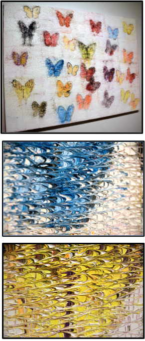
Take this 36 x 48” oil on canvas by Madison Gallery- La Jolla, CA- artist Hunt Slonem called, “Morphos & Catelayas.” It looks interesting enough at first glance, but the surface texture and how Slonem has handled the paint changes everything. From afar it looks like the artist has tried to give the butterflies movement through line work and cross-hatching, but once the viewer gets closer to the piece they see the layering.
Slonem (American, b. 1951) is known for this technique in his portrait, butterfly, bunny rabbit and bird paintings. He creates the image and fills the entire canvas, building up layers of paint as he goes. Then, as the paint has started to dry and stiffen a bit, he uses the opposite end of the paintbrush to scratch and drag the paint.
The end result is a texture that keeps the eye moving across the work, following the lines of the grid and jumping from color to color. It captures light, creates shadow, and draws the viewer in.
Another work that caught my attention was a work by Emil Lukas (American, b. 1964). I saw the 32 x 26 x 3.5” piece when I walked into Hosfelt Gallery’s –San Francisco, CA -booth. It was on the back wall and it had a fuzzy, almost ghostly look to it. I couldn’t figure out what was going on. So, as good contemporary art does, it pulled me in.
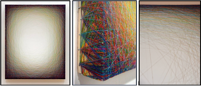
It was thread! Silk thread woven over a painted wooden frame and held in place by nails. This engaging work, titled “Sound of Spinning, #1360,” comes from a series Lukas has been working on for over three years. He calls them thread paintings, and estimates he has probably used over a mile of thread on some works.
The work is a very interesting approach to surface. It is simple and impactful. Utilizing color theory and layering of the silk, the artist is able to give depth and create opacity. The webs of thread are kept dense at the edges and loose towards the center. The interior panel of wood is painted white and it shows through the silk. The end result is incredible. It tricks the eye and engages the audience to find out what is really going on.
Another set of work that attracted my attention was by Korean artist Seon-tae Hwang.
Again, it is hard to tell from images, but these things glow - literally. They are tempered glass, sandblast, and LEDs. The LEDs are behind the glass and they illuminate the works to emulate the sun. Rays of light reach in through windows and a broken roof; they cast long shadows and run over bright green plants. I saw these and knew they would get a glowing review from the audience….eh? Glowing…see that? It’s a pun cause they glow. Good art, bad jokes, moving on.
Another element that points to the Dallas Art Fair’s success and growing influence is the number of foreign exhibitors. This year they made up almost twenty percent of the galleries attending. Seon-tae Hwang is represented by GAMO Gallery in Seoul, Korea. The combination of great collectors, museums, overall atmosphere (we call it Southern charm) and quality artwork has allowed the fair to gain an influence that draws galleries like GAMO to attend.
Some more cool stuff:
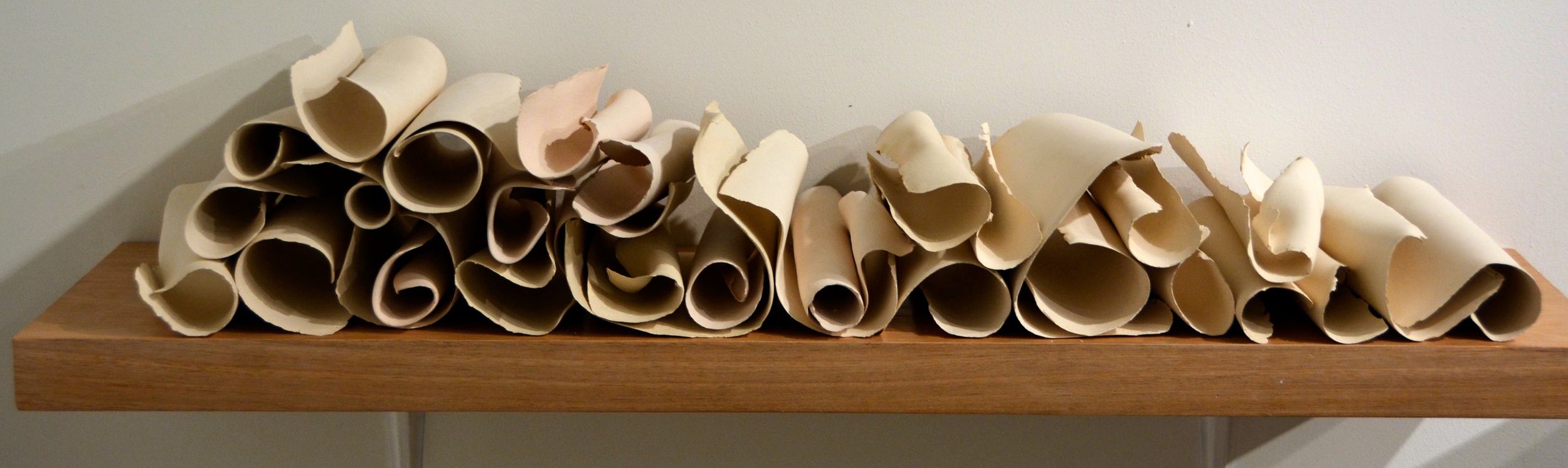
A work by Carol Young, represented by Columbian gallery Beatriz Esguerra Art, is made to look like scrolls of paper, but the artist uses ceramic. I really wanted to pick one of these up. The pages are empty, but the detail of creases and folds are recorded. There is an interplay with the eye as you look at the stacked scrolls. They appear light and fragile, much like aged paper, but they have the strength and durability of ceramics. The installation pushes against the audience’s view of the material in front of them.
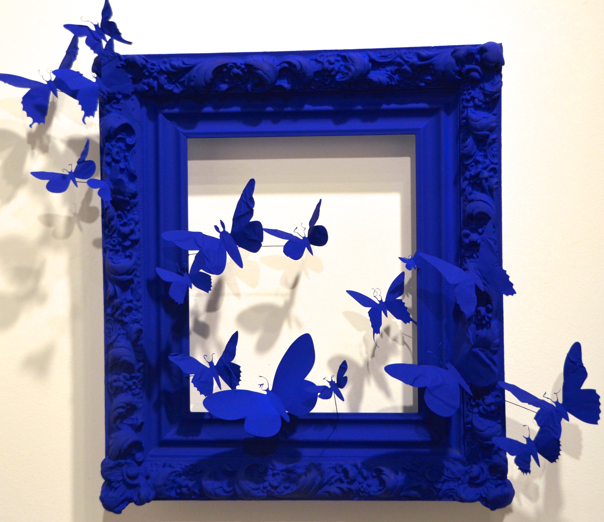 Paul Villinski’s work, “Mirror IV” made from an Antique wood frame, aluminum from found cans, wire, steel and Flashe paint, is very engaging. The butterflies cast shadows onto the wall, each other and the frame, all of which is covered in a thick layer of Flashe paint. Flashe is a vinyl acrylic that dries very quickly and is matte; the finish resembling the powder pigment used by Anish Kapoor on many his sculptures.
Villinksi (American, b. 1960), represented by Morgan Lehman Gallery -New York - is a pilot and environmentalist, so imagery of flight and recycled materials are often found in his work.
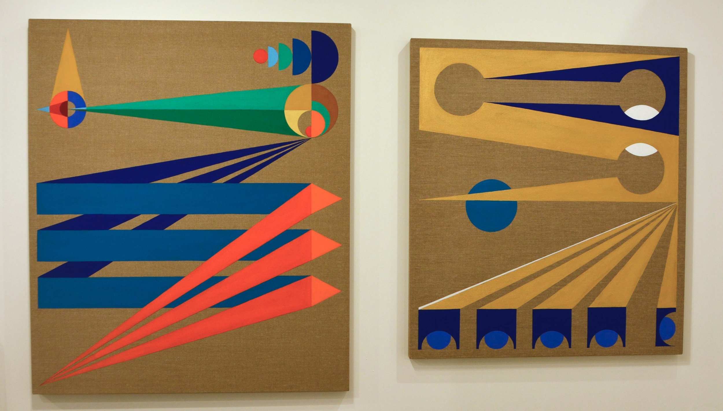
These geometric Flashe on linen works by Eamon Ore-Giron (American, b.1973) of Et Al - San Francisco, CA - were interesting. The matte result of the Flashe paint on top of the shimmering raw linen makes the paint pop off the surface. This is enhanced by the use of bold shapes and bright colors coupled with the perspective play the artist employs through line.
The award for my favorite gallery at the show goes to Gallery Henoch of New York City. Henoch has some of the best contemporary painters who paint realism (hyperrealism, photorealism, superrealism) each putting their own spin on representational imagery. They represent some of my favorite working contemporary artists, the likes of Eric Zener, Robert Jackson, Steve Smulka, Janet Rickus and Steve Mill.
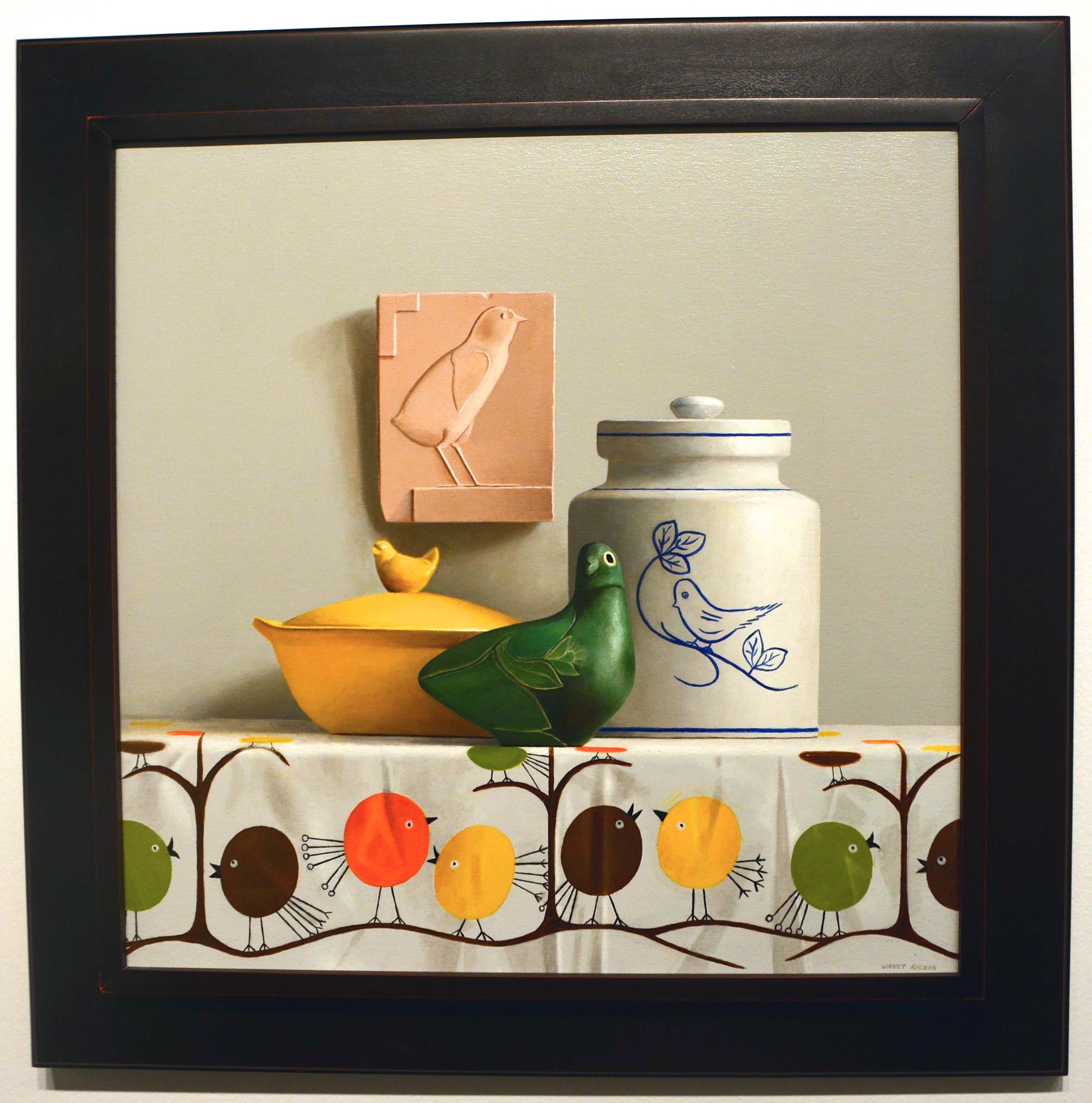 Here is “A Bird Painting” by Janet Rickus (American, b. 1949) of Gallery Henoch. Rickus paints realistic still life oil paintings, a lot of her work depicting fruit and vegetables in natural light.
The objects are painted to actual size and are placed atop table linens that cooperate with her subject matter’s color and form. She gives great attention to detail, whether tending to the soft shadow in a crease of the tablecloth or the smooth line of a jar; her work makes you want to reach in a pick up an item from the table.
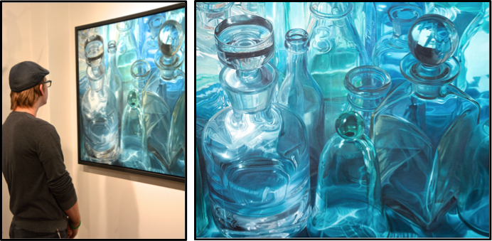
I was pulled in by a 32 x 42” oil on linen by Steve Smulka. Because look at that thing… His play with light and reflection is great. This work “True Blue” has several glass containers huddled together. They are oversized and lean slightly toward the viewer, imposing on your space. His skill is evident in his treatment of the glass, but his works are all about the light. The light is what gives the work movement and life. The linen is almost monochromatic, saturated in blues and turquoise. By using deep blacks for cast shadows and bright white for reflection and light, Smulka transforms the glass; he makes it hyperreal, much more than just bottles.
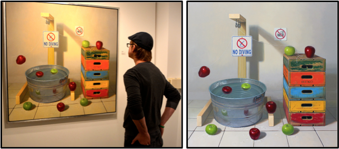
This is Robert Jackson’s 48 x 49” oil on linen called “No Diving.” Jackson’s works are realistic, colorful and full of whimsy. He calls them contemporary still life works because his goal is to take the traditional ideas of a still life painting and bring them into the contemporary world; make them something new. He takes inanimate, everyday objects and brings them to life. The objects, whether apples, balloon animals, or kids toys, are personified and become characters in a performance, usually with a dose of humor.
Apples, for example, as used in “No Diving” and many of his paintings, have lots of symbolic meaning throughout art history - the sin of man, a forbidden fruit, a representation of knowledge, love…. When Jackson takes the apple, takes the symbol of the apple and all that goes with it, and places it in a whimsical painting, the result is exactly what the artist was going for. Something new. He also does this with his wooden crates. He has taken away the main prop in all of still life painting, the table, and replaced it with fun vintage sugar water crates.
This is the second year the Dallas Art Fair has coincided with Dallas Arts Week, and it wont be the last. In 2013 Mayor Mike Rawlings instituted the Dallas Arts Week to fall on the same week every year. It is a great citywide celebration of the arts; there were literally hundreds of events and venues for people to choose from this year.
As a city, Dallas is steadily growing its presence and reputation in the art world and the increasing success of the Dallas Art Fair is a large contributor. It was a fantastic show!
-M.P. Callender
![]()