Uncategorized

Tire Kicker's: An Ode

This Ode to the Tire Kicker was originally posted in 2012, but we here at Signet Art are left in wearied bemusement at the chutzpa of this particular type of client...or non-client, I should say.  They contact us with regularity and never cease to surprise, impress, astound and many times insult us with their inquiries and requests for our professional assistance. The Kicker is an interesting beast; they come armed with art (which they have questions about), the internet (of which they believe they are an expert researcher), a need to know answers (immediately), and empty pockets to pay for our services. It is an oldie but a goodie, we hope you enjoy!

Four years to earn my Bachelor's in Art History plus almost four years under the tutelage of our certified appraiser of fine art, who herself also has a degree in the arts and has been appraising for over 26 years . . . and a large portion of our time is utilized handling the tire kickers.  What is a tire kicker?  You know them; they are indecisive about purchasing a product or service, and never feel satisfied with what they are offered. The calls usually start like this:

"Hi, I have an original Bill of Rights.  What's that worth?"

"I have a Declaration of Independence I found in a house we just purchased.  Can you tell me its value?

One of my all-time favorites, "I have one of the Last Suppers, how much can I sell it for?"

You think I'm kidding; these come in at extreme regularity.

"I know it's expensive 'cause I just saw it in a museum."

"I have a painting by 'Insert Name of Well-known Artist Here'.  Can you tell me how much that's worth?"

Once we get past the initial issues- "No, ma'am.  I promise you don't have one of the Last Suppers." - and talk about their need for an appraisal and the services we can provide, it only gets worse.

"You mean there's a charge?"

This is where my brain does its best to keep me from kicking the tire kicker right back through the phone.  I want to reply that, "No, I was only kidding, there's no charge.  We do this as a hobby, you know, just to pass the time."

By their nature the tire kicker is a persistent beast, and explaining our services and how we can help does not dissuade them.  In fact it only makes them squint their eyes and change tactics.

"Well, can I just e-mail you a picture and then you can tell me if it's worth getting a consult?"

I say "No" and explain to them when you transfer a piece from one medium to another, i.e. from an oil on canvas to a JPEG image, it only hinders the inspection.  There are reasons an appraiser needs to physically view and inspect your artwork.  But, again, explanation only bounces off their thick rubbery skin; they are after free information, and will stop at nothing to try and get it.

"Yes ma'am.  Our appraiser charges for her time." "Well I don't want to pay for an appraisal or a verbal consult if the art isn't worth anything, do you know any place I can call that doesn't charge?" (Seriously . . . I get asked this almost every day) "No ma'am.  Any appraiser out there worth their salt is going to charge you for their time."

Again, I have to suppress my inner monologue that wants to wish them the best of luck searching Google for three hours, having no idea what they are actually looking for.  But, I try to remain polite and professional and usually manage to do so . . . usually . . . at least 90/10 . . . ok, maybe 80/20.

By this time if the conversation has yet to penetrate and they persist . . .  "It's a landscape with a small boat and it has a signature at the bottom and its beautiful, I can just tell it's valuable.  I have good taste."   . . . we politely draw the analogy to the doctor they happily visit when they are sick, who has years of training and valuable knowledge and also refuses to diagnose them over the phone.

We have a love/hate relationship with the popularity of shows like "The Antiques Road Show", "Pawn Stars" and "Storage Wars".  We love them because they are entertaining shows that have spurred an increased fascination with the value of personal property and we all benefit from that.  We enjoy the shows and like seeing treasures found in Grandma's cellar just like anyone else, but these shows give the impression and reinforce the idea that expertise should be free.  The viewers don't understand when they see an expert on "Pawn Stars" tell someone all they would ever and could ever need to know about their piece, that they are appearing as a marketing tool.  They are advertising themselves as an expert in their field, and are advertising their business.  Which, as a note to the magic of television, these experts are often portrayed as having their frontal lobe packed full of answers on any and all items in their field they just can't wait to get out.  This isn't a bad thing, it's good T.V. in fact, but in actuality the expert is given ample time to see, inspect, examine and research the items he or she will be commenting on.  It's true.  We've done it here at Signet and many of our colleagues within the art world have as well.  The tire kicker does not understand this and expects the floodgates of information to come bursting open when they describe their item.  "Have you heard of the artist? It is signed at the bottom, I think it says G I C L E E . . ."

The rise in popularity of shows like these are why Signet Art started offering quick, professional verbal consultation appointments many years ago. "Well, what's a verbal consultation?" The verbal consult is a quick, in-office examination and advise session with the appraiser.  We recommend the verbals for clients who need a professionally trained eye to give them expert advice and direction with their artwork, but who do not need a written appraisal report.

The era of Wikipedia, Yahoo and Google has too many convinced that if you just spend enough time online, you're an expert.  The tire kickers are certainly under this impression, and it's not entirely their fault.  Technology has been advertised for years as able to give you access to all the information you could ever need, right at your fingertips.  This, as anyone who has spent time out in the light of the real world would tell you, is false.  There is training for a reason and there are experts for a reason.

It comes down to virtual images versus actual hands-on inspection.  If you do not know the "what" of what you have and you search online, you end up comparing JPEGs with JPEGs.  Thousands of online images with other images that, probably, are in no way related.  This isn't even close to comparing apples with apples, it's more like comparing windsocks with helicopters- they both are outside, sure, but one costs a hundred bucks and one costs a few hundred thousand.  The online search to get real answers to your fine art can be very misleading and dangerous when you don't know what you are, or should be, really looking for.

Just because you send us a picture of a Salvador Dali piece, for example, does not mean that is what you have.  Dali, like most artists, worked in many mediums and styles; oil on canvas, wood cuts, etchings, pen and pencil sketches, sculpture in both wood and metals. . . and you may just have a poster, but you are looking online at his oils on canvas going for millions at auction and you are already dreaming of your new two-story by the lake. "But I thought prints were still valuable?  It's numbered at the bottom and is signed.  Did I mention it was signed?  It has a signature. . ."  The type of a print needs to be determined.  Color lithograph, offset-lithograph, serigraph, woodcut, etching, mezzotint, engraving, a monotype . . . all are printmaking methods, and each vary in value and collectability, multiple factors must be considered.

Expertise in the art world is built upon years of handling and looking at actual artworks, and years of research and investigation within the field.  Actually recognizing surface quality and textures, being able to determine the medium, condition, age and whether or not items are authentic.

So, once I've held firm for the entire conversation and have explained thoroughly what we can offer them, the tire kicker gives and decides they, "will think about it and will call back to schedule an appointment."  I hang up the phone, then go wash the tread marks off my face before the next one comes.

sa_logo_72dpi.jpg

-M.P. Callender

A Book Review of Catalogues Raisonné: Buy the Remington, Leave the Russell

Warning: This blog post is going to be about a topic that is somewhat esoteric, the good and bad of Catalogues Raisonné.  It is also going to be a bit of a rant.  If either of those two caveats doesn’t dissuade you, read on.   Hidden within is a book review of one of the best and one of the most frustrating I have recently encountered.  If you just want the book review part, skip down a few paragraphs ..... Just trying to be helpful to readers. A bit of background…  appraisers collect lots of books on art.  The longer one is in the field, the more crammed one’s library becomes and the pickier one becomes about adding new reference books, especially in a day when so much information is becoming accessible online.  My library reached capacity several years ago.  That doesn’t mean I stopped buying books.  But it does mean I really assess closely the utility of a new reference book before pulling the trigger.  A few years ago, I had a water damage incident that reached the doorway of my office but gratefully did not cross the threshold.  Unfortunately, all the flooring had to be torn up and replaced.  So, all the books had to be packed, carted away, stored and reinstalled.  I used that situation to address office configuration and added lots more bookshelves.   But, those quickly filled up as well.  All of this to say, I am only interested in acquiring the most comprehensive book on any given artist, which translates to the catalogue raisonné on that artist.

For those who don’t know, a catalogue raisonné is an author’s attempt to list and describe every work an artist has done in a given medium.  The CR is the author’s attempt at a thorough examination of all known pieces by that artist in the medium covered.  Important artists who work in multiple media might have a CR for paintings, one for prints and one for sculpture. CRs can be many volumes.  They are normally organized chronologically but can be organized by particular subjects.  But the one quality that all good CRs share is comprehensiveness.  At the very least, a CR should have a complete list of known works in that medium and good pictures of each piece.  The best CRs have wonderful additional information – ownership history, exhibition history, cross-referencing of the artist’s biographical information with the known works in order to better understand that course of the artist’s progress, etc.

The utility of a good CR to an appraiser is clear.  If I am working on an appraisal of a given painting by a well-known artist and want to know whether it is an accepted piece within the artist’s oeuvre, the first place to check is the latest CR.  That author or group of authors has usually put years into examining the artist’s work and gathering information on all known pieces.   CRs are, by their nature, limited to the known works.  Almost the minute a CR goes to press, new works surface from various private collectors who were not aware of the production of the CR and whose paintings have been hidden in private collections for generations.   So, supplements and addenda to the catalogues are common.

CRs

Imagine my excitement then, when I happened on Charles M. Russell-A Catalogue Raisonne published in 2007 with a descriptive listing promising that book owners would be given a Key Code allowing them access to the online CR.  I imagined that this online edition of the CR would be where newest updates would be reported, newly discovered and accepted works reported, further research on individual pieces tracked.  I fully expected that in purchasing the book I would be getting a comprehensive CR plus the online updates.  Bonus!

I bought the book several months ago, put it on the shelves to languish until I needed to reference it for an appraisal.  I admit that I did not peruse it until the latest appraisal came up.  I am working on valuing two known paintings by Russell.  The authenticity of the works is not in question.  So, I plopped open the book and began looking through the Contents page for the comprehensive listing.  Not there.  I flipped back to the Index and searched by title.  Not listed.  What?  I flipped back to the Contents page to see if I missed something.  The book consists of a few good essays on the artist’s life and work, each illustrated with color images from Russell’s work, a section of large color plates that, as far as I could tell, are randomly selected.  These plates are not listed chronologically or by topic.  It’s just a section of pretty pictures.  When I did go to the online listing and search by title, there was a brief listing of each of my client’s paintings and a good picture.  No additional information.  I got nothing more from this resource than the facts I already knew.  What a researcher looking at an undated painting or one where she did not have the title at hand would do is beyond me.  Even online, the works are segmented into year batches.  You can search by year, by medium and by subject.  But if the system does not like your query it throws you into the wheel-of-death limbo and you best restart the search.   Bottom line ---  Charles M. Russell-A Catalogue Raisonne is a coffee table book, not a catalogue raisonné.   Even with the addition of the online access, the material is organized in such a frustrating way that I cannot recommend this book.

Not sure where this project went off course.   I had high hopes for the book, in part because one of the contributing editors, Peter Hassrick, is a well-known expert on Russell and a co-author to one of the best-written CRs I own, the two-volume Frederic Remington- A Catalogue Raisonne.  The Remington book is everything that the Russell book is not—comprehensive, catalogued by date, incredibly well researched.   Odd that in the world of late 19th-early 20th C. western art where Russell and Remington are constantly compared, a look at their CRs would bring up the same comparisons.  But, if your shelves are as cramped as mine, buy the Remington CR and leave the Russell one for the amateurs.

-Brenda Simonson-Mohle, ISA CAPP

Summer Seminar - Foundation for Appraisal Education

Foundation for Appraisal Education
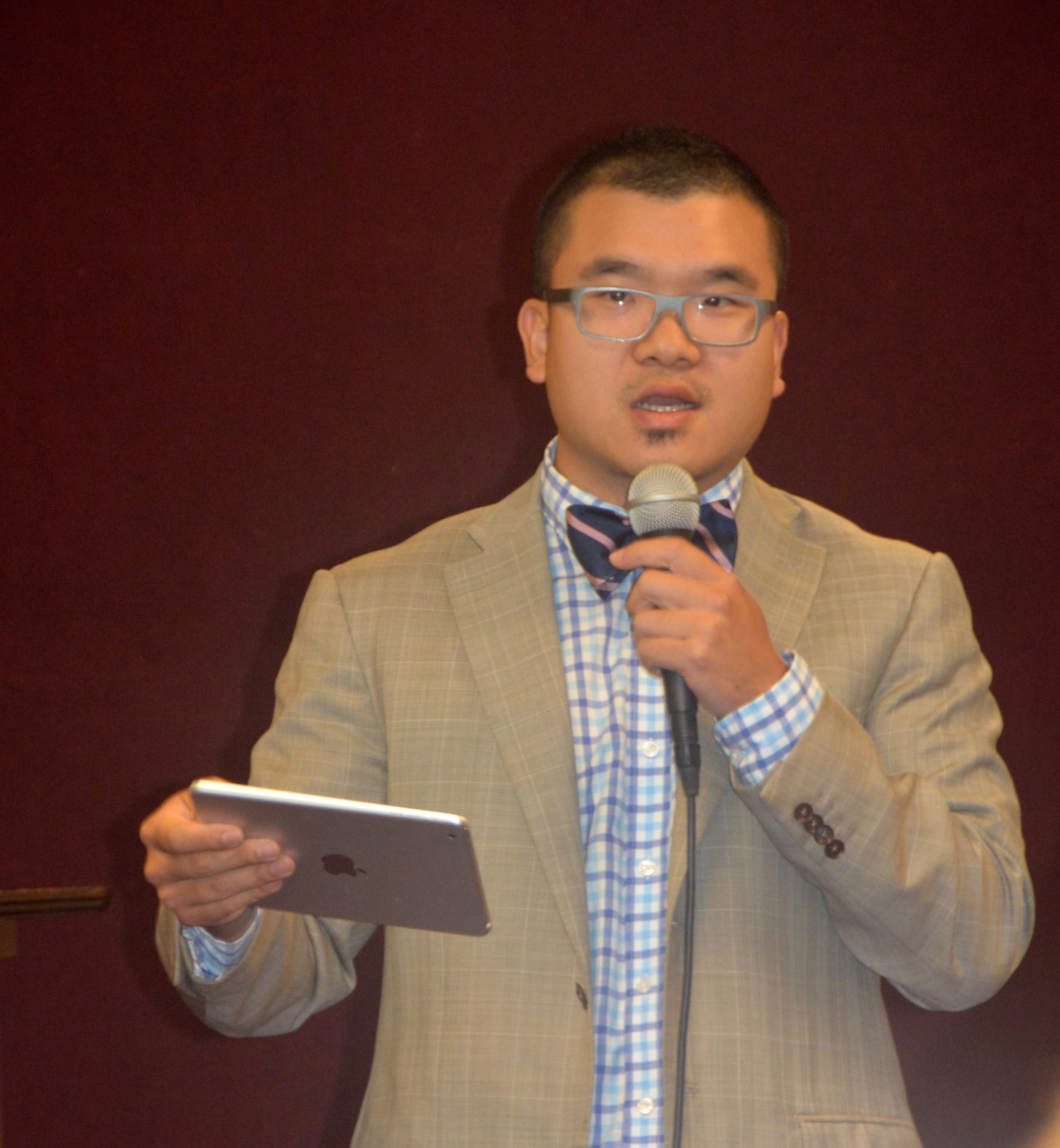
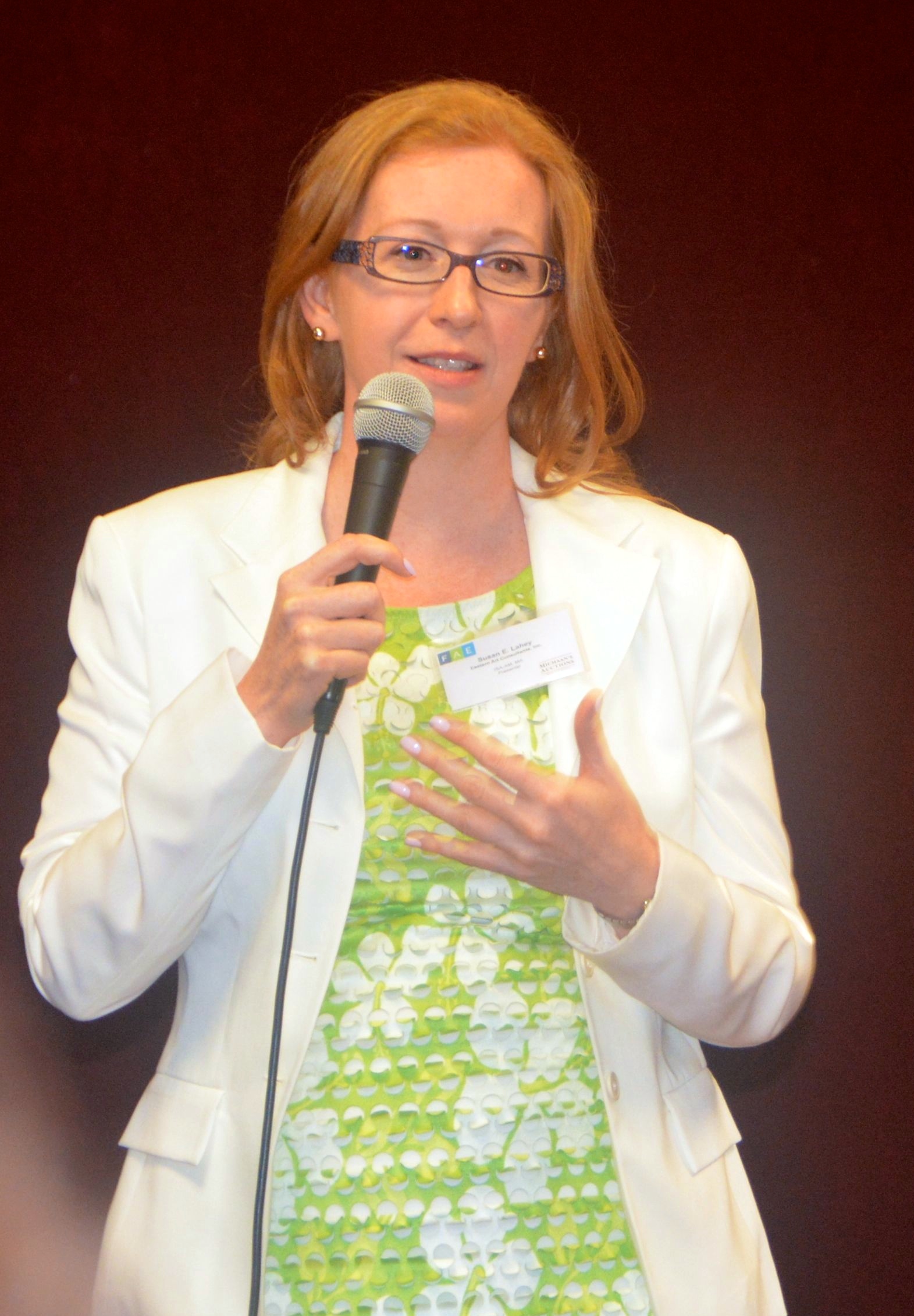
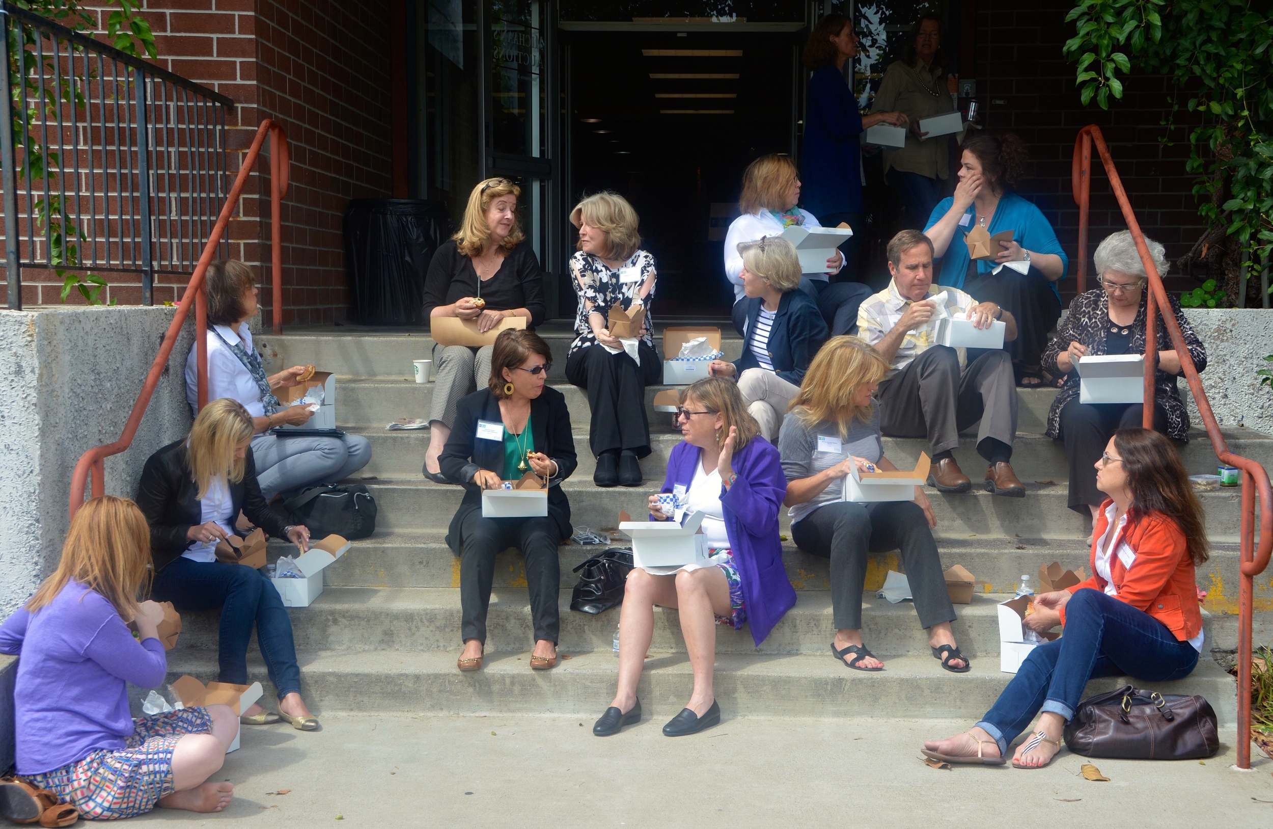
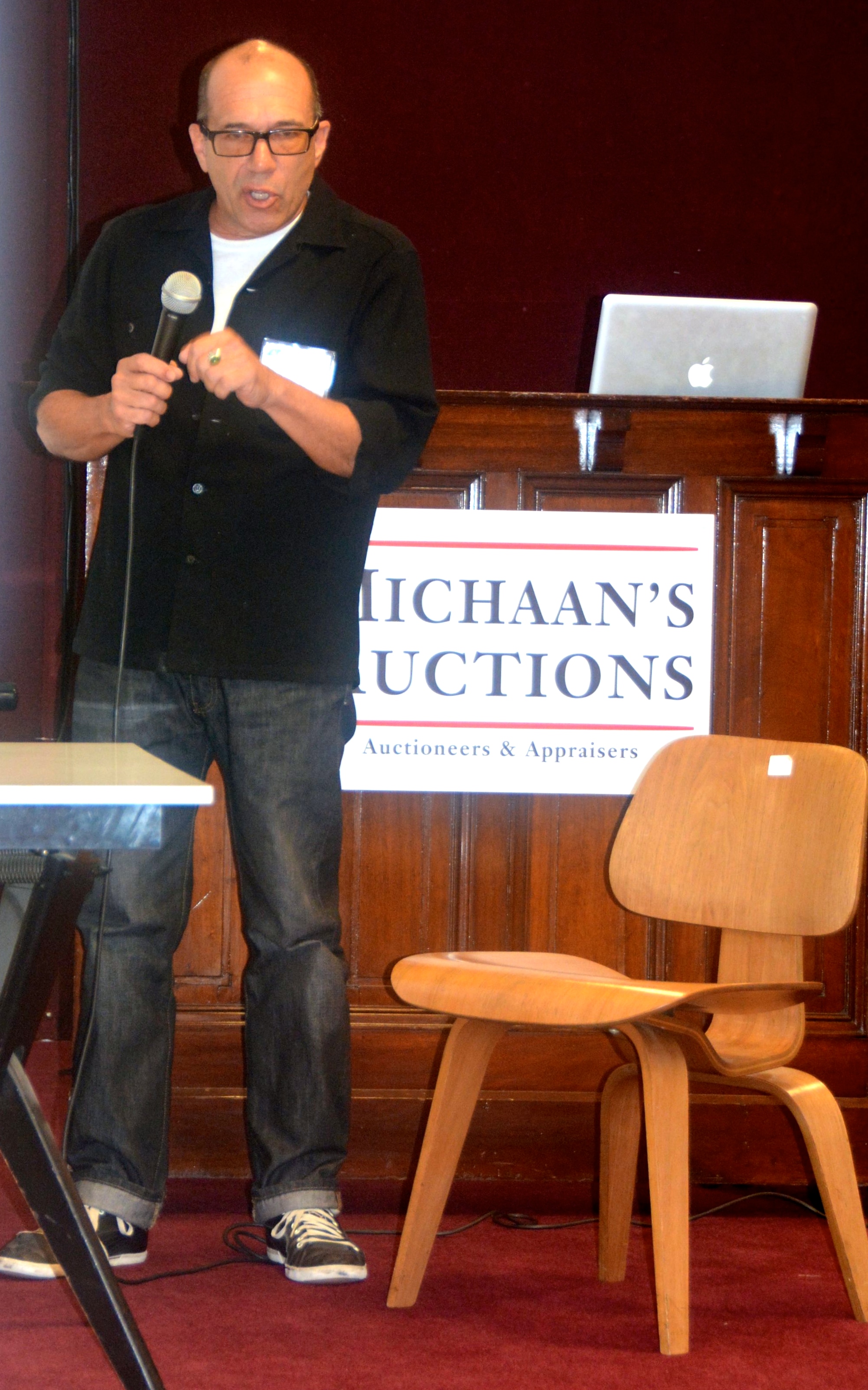
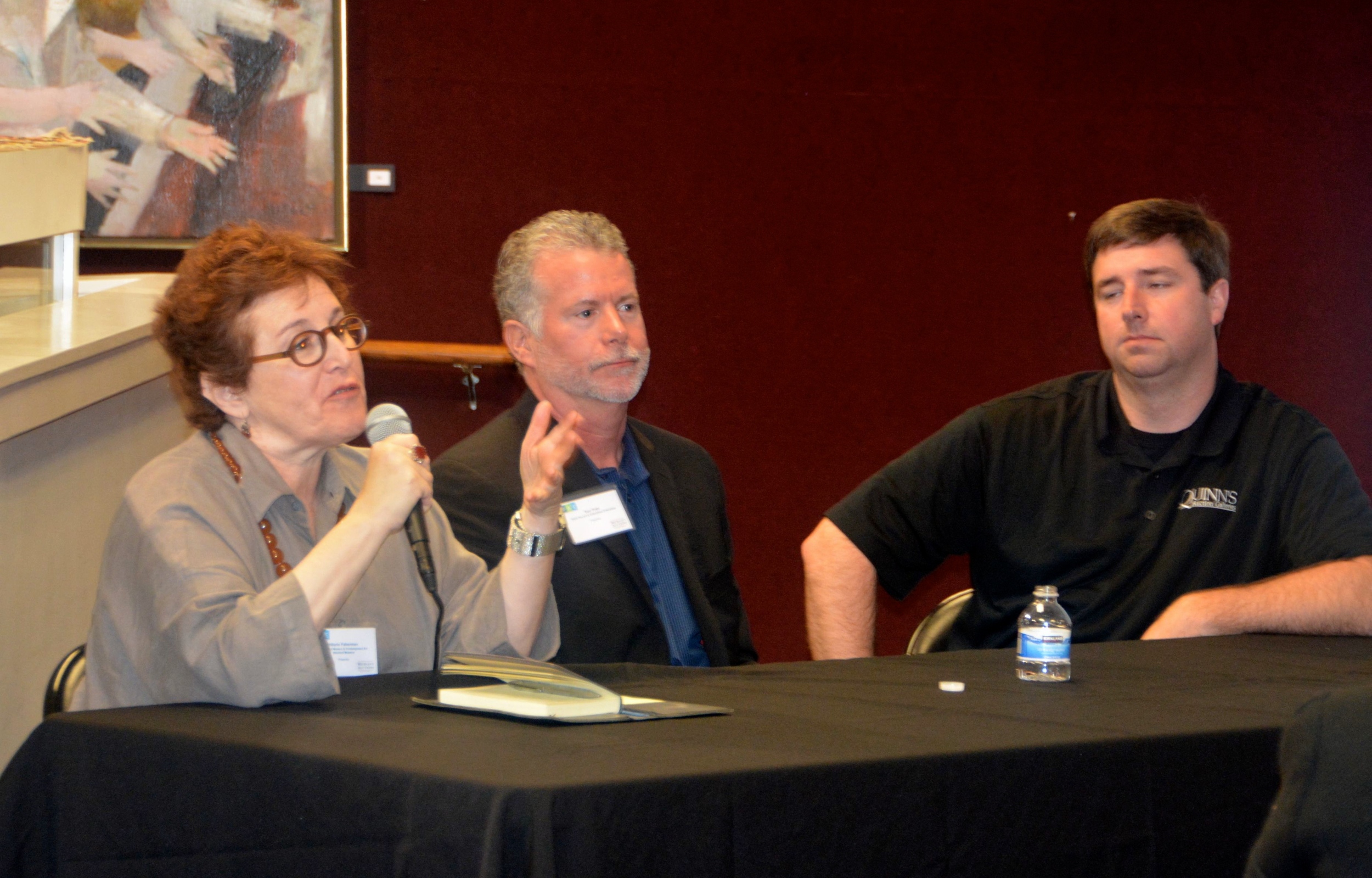
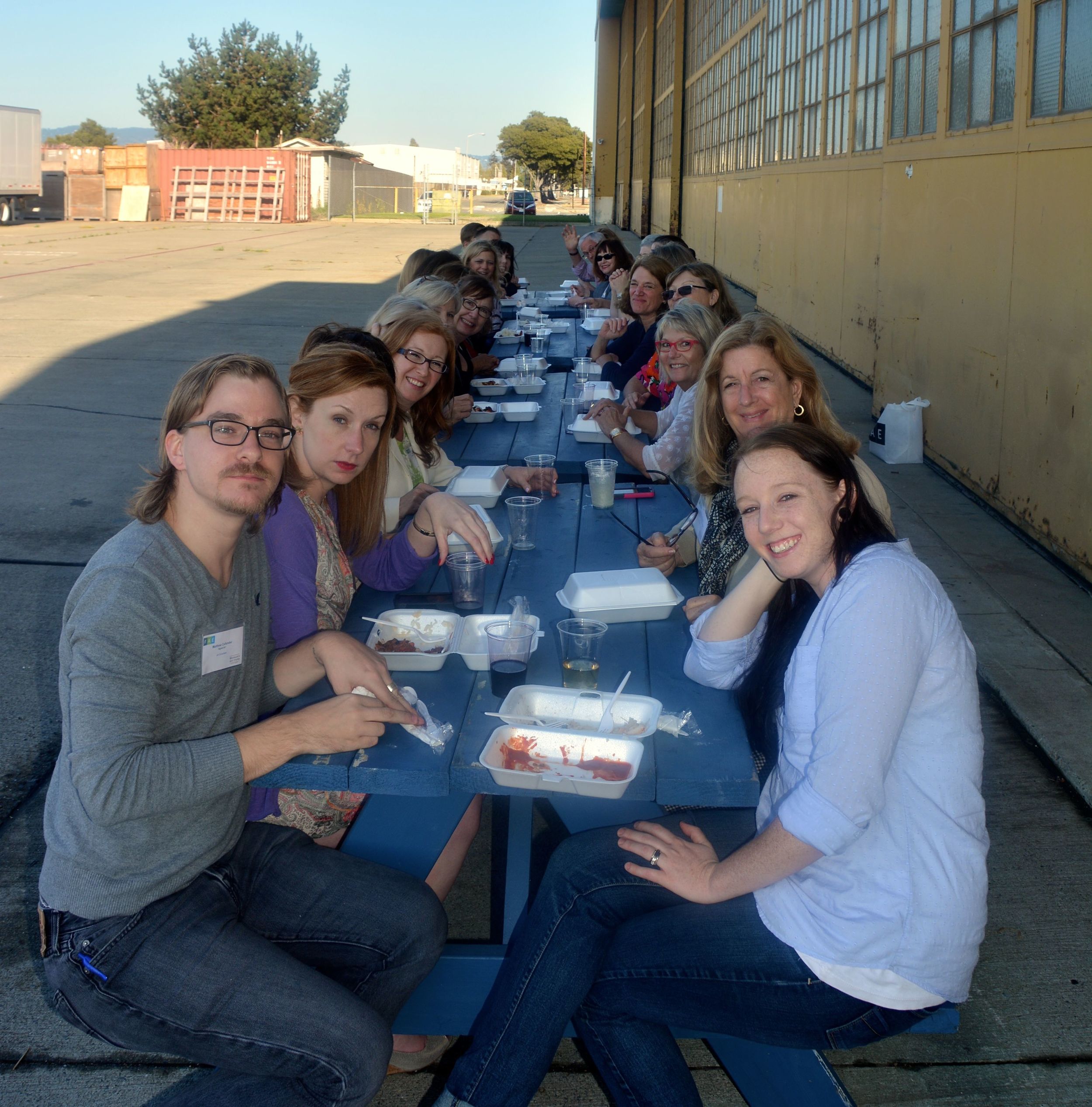
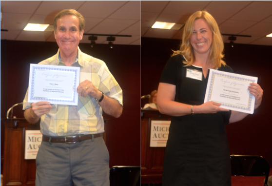
A few months ago I got an email notification for the Foundation for Appraisal Education’s (FAE) annual seminar. The speakers sounded intriguing and the chance to escape the Texas heat for a few days in the San Francisco Bay area made the attendance enticing. Yes, I assumed we would be busy with work and would have to set things aside for a few days, but appraisers are just human. We need rest, relaxation and inspiration like other mere mortals. So, I signed us up. The ‘us’ included my able assistant Matthew Callender, our respective spouses, and myself. Why not combine a few days learning with a few days of R & R over the weekend? 
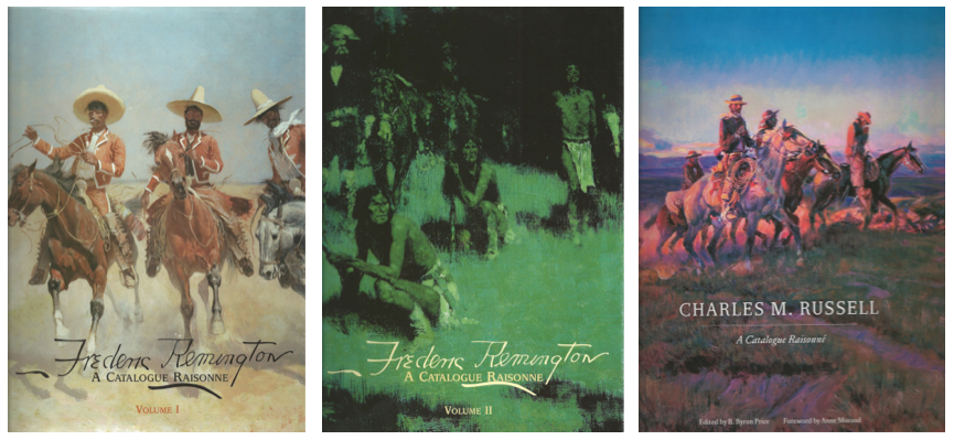
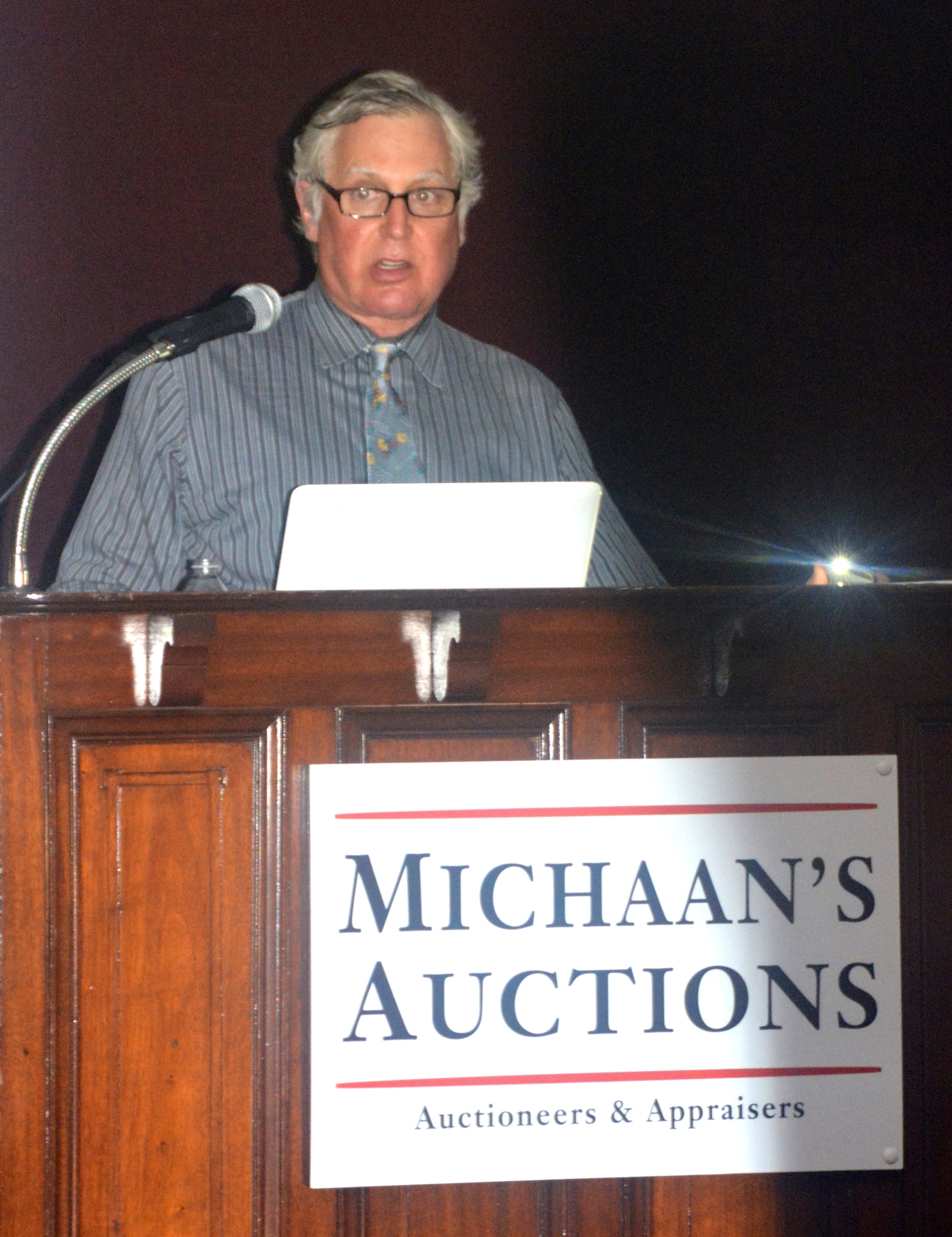
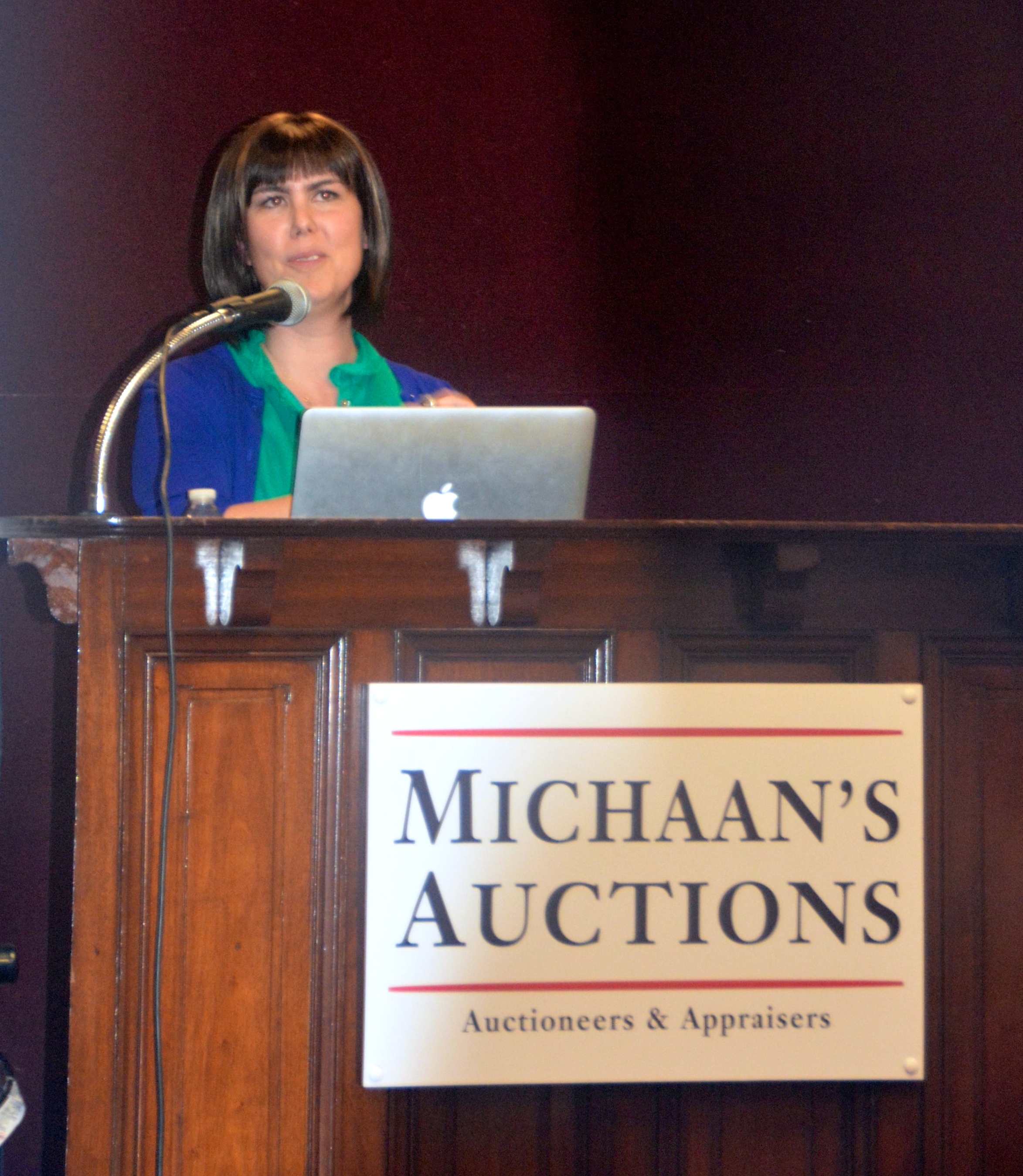
We landed at SFO to a cloudless day and temperature of 72°--already a mood shifting change for the better.   Don’t get me wrong, as a native of Texas I am a big booster of our state, but even I know that anyone with brains and money tries to leave Texas for cooler climates in the middle of the summer. Most of this summer has been mild but I have been clinging to the hope of this trip in order to get through the last few weeks of sweltering weather. We made our way to Alameda across the bay and checked in. Then made our way to the opening reception of the conference, hosted this year by Michaan’s Auction house.

Maureen Winer, President of FAE. with Allyson Bradley of Michaan's Auctions

Wow! What a host! Allyson Bradley and the whole Michaan’s staff showed us hospitality beyond measure. The reception was filled with scrumptious food and libation.

It gave us a chance to look over Michaan’s upcoming auction items and chat with other appraisers from across the country. Good start to the conference.


Harry Huang, Asian art expert with Michaan’s

On Thursday, most of the speakers were impressive. Harry Huang, the Asian art expert with Michaan’s, gave a talk on snuff bottles of organic materials, followed by a great opportunity to examine and discuss the pieces.

The advantage of a seminar in an auction house is the chance for hands-on examination.

Hands on


Susan Lahey, President, Eastern Art Consultants Inc.

He was followed by Susan Lahey, ISA AM, MA, who spoke on the market for contemporary Chinese art, a fascinating and timely topic---this is an area of collecting that is red hot in today’s market. Susan appraises both traditional Asian/Oriental art and this late 20th-early 21st century iteration.   She is also an accomplished speaker who understands a crowd of appraisers wants lots of info… she came prepared. Good job, Susan!

Susan was followed by Brian Witherall of Witherall’s Auction House. Brian spoke on Gold Rush era jewelry and accouterment. The pieces are not anything we will ever run into or appraise, but Brian’s talk was informative.

DSC_5496After a luscious box lunch and a few moments of sitting on the steps soaking up some California sun, the afternoon speakers began. I had perused the itinerary and was excited to hear the speaker on “California Art.”  That is, until he opened his mouth.   The talk was so ill-prepared that I will leave the speaker’s name out in order to save him the embarrassment.   Seriously?   This fellow was a long-time dealer in the area and was there representing an auction house that I will also skip in order to save them the embarrassment.   The old cliche ‘phone that one in’ would be a generous understatement of that presentation.   Too bad!  Such a great topic with such good potential …wasted.

Steve Cabella of Modern I

The day closed on a good note though. Steve Cabella of Modern I gave a great presentation on the field that used to be called “Post War Design” and is now referred to as mid-century modern. Steve has been a dealer of this sort of furniture since long before it was the hottest trend.   Most of these items are not signed with the designer’s name so Steve has a large collection of vintage design magazines and has long hours poring through them to match unsigned pieces to the right manufacturer. He knows the designers well and he gave an interesting and informative talk.

Friday began with a three-person panel on authentication.   Hilarie Faberman, a Curator of Contemporary Art at the Stanford University Art Museum, Matt Quinn of Quinn’s Auctions and and Tom Pratt, an insurance agent who specializes in fine art. Each gave real-world examples of situations when authentication had been necessary to properly value items.

Panel with Hilarie Faberman, Tom Pratt and Matthew Quinn

Ben Marks, the art writer for Collectorsweekly.com, moderated the panel. The topic of authentication is always an important one to appraisers… when does one need an authentication, how to find the right person, the logistics of getting the piece in front of the authenticator and all of the latest news about various authentication boards that have shut down for fear of litigation…. Good meaty information.


Allen Michaan of Michaan’s auctions

Allen Michaan of Michaan’s auctions gave a beautifully illustrated talk on the career of Louis Comfort Tiffany and the many areas of art and decorative arts he and his company delved into. The biggest revelation to me was that Tiffany had started out his art career as a painter.   Who knew?   He was a decent painter but really found his niche when he began to delve into interior decoration and produce stained glass windows, lamps and other desk accessories for his clients.   He and a team of colleagues were commissioned to do stained glass windows for many churches and public buildings in the early 20th C.


Laura Wooley

After Allen’s presentation,an independent appraiser with extensive auction house experience in the sale of celebrity collections, talked about the collecting of celebrity memorabilia. Values in this field have much more to do with the popularity of the owner and the historical importance of a particular item than with any other factor.   It’s a fascinating field but one where comparables must be crazy to find. Is a Marilyn Monroe item equivalent to an Elvis item or would the better comparison be with JFK?   Some real challenges in that field!   The day ended with a presentation on wood identification by lumber expert Rick McDaniels of McBeath Lumber.


Lunch at the Michaan's Auctions Annex

After two days of class time in Alameda, we stretched our backs and moved our bags into a lovely, quaint French-style hotel in San Francisco, the Hotel Cornell. Lovely place!   The location is great, very near Union Square and rooms are small but charming.   There are posters on every wall that does not have hand-painted homages to French art and culture. The small café downstairs cooks up a fresh breakfast to order and has faux-painted stone walls, French farm implements, and a Joan d’Arc sculpture.   We spent the next few days trekking across San Francisco, taking in the sites and reveling in the cool temperatures.


Kirsten Rabe Smolensky and Fred Winer receiving certificates for their service at FAE

Now, it’s back to the office and the rather large stack of appraisals that need to be completed.

Brenda Simonson-Mohle

The Sixth Annual Dallas Art Fair

The Sixth Annual Dallas Art Fair was a success this year. I say it every time the show comes around, but this is a great opportunity for both collectors and art aficionados to see and purchase some of the best in modern and contemporary artworks available from all over the US and overseas. If you were not able to make it this year, here is a quick video summary of the show compiled by BlouinArtInfo titled, “60 works in 60 seconds.” http://www.youtube.com/watch?v=plpy06jmH30

Art dealer Chris Byrne and real estate investor John Sughrue founded the festival in 2008 by looking at themselves as the audience and asking, ‘wouldn’t it be fun to go to a contemporary, postwar art fair in Dallas?’ They decided to make it happen. It started with talking to gallerists who were working with collectors and museums, and has continued to grow since then.

And it has grown steadily each year. This year the Fashion Industry Gallery hosted almost 100 galleries, all of which were invited to participate. The galleries show support for one another and each year recommend others they feel would do well at the show. The invitation to exhibit is a unique aspect of the fair, it is a distinguishing factor that cultivates a great overall exhibition for the diverse collecting audience Dallas brings.

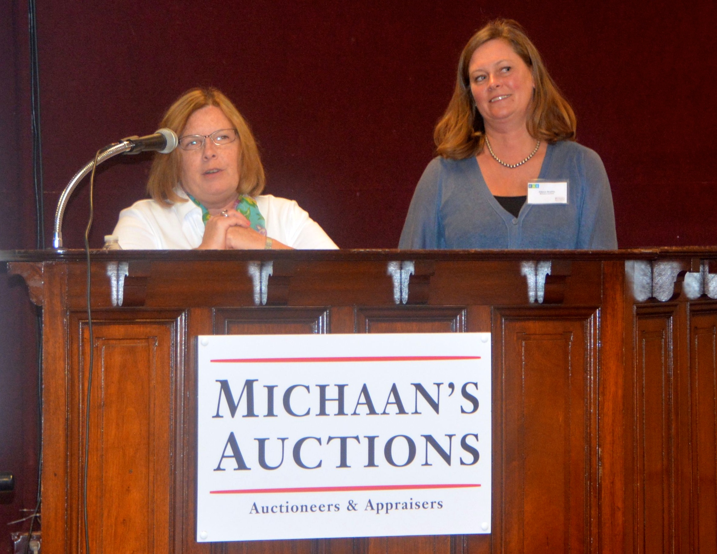
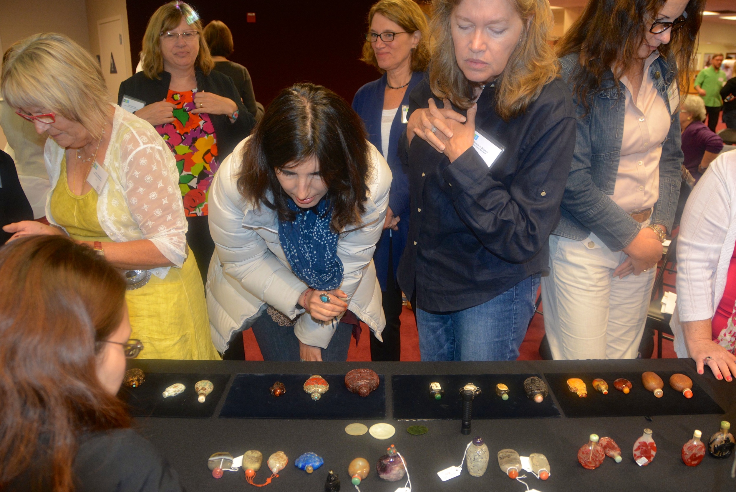
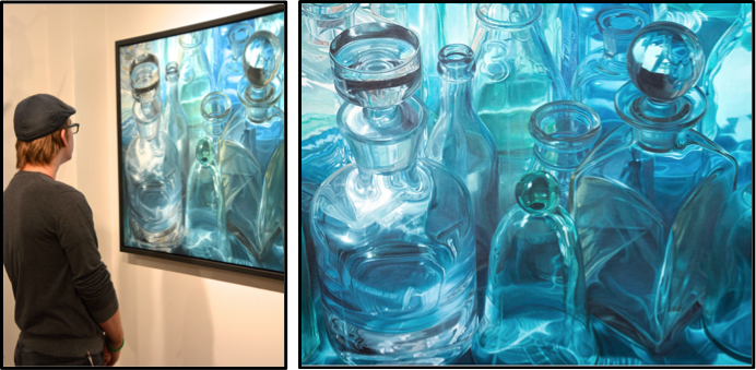
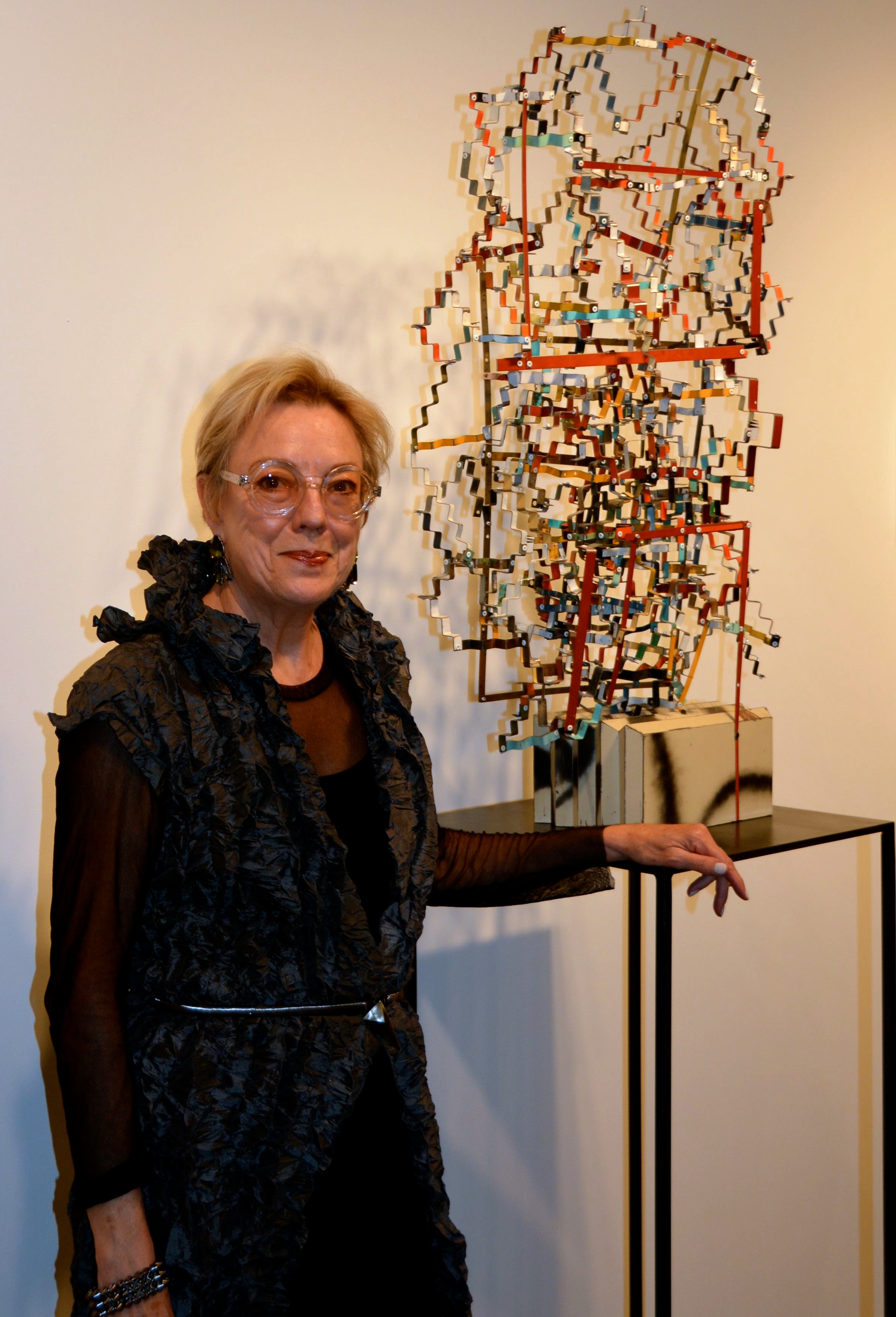
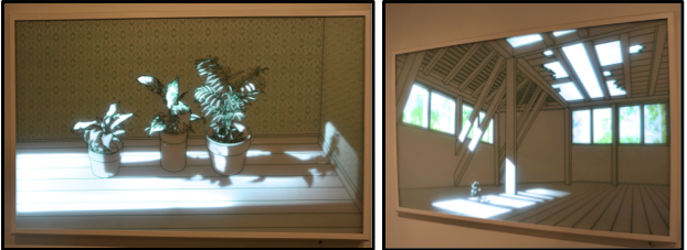
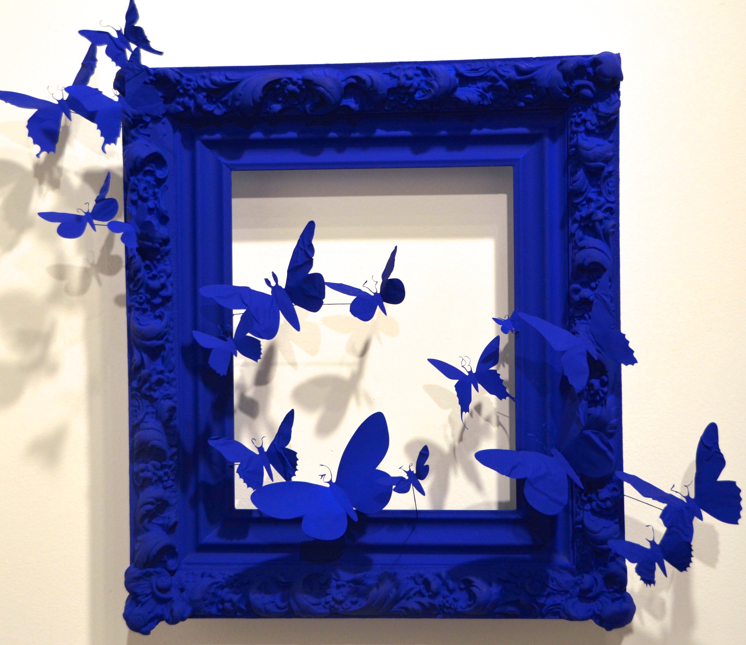
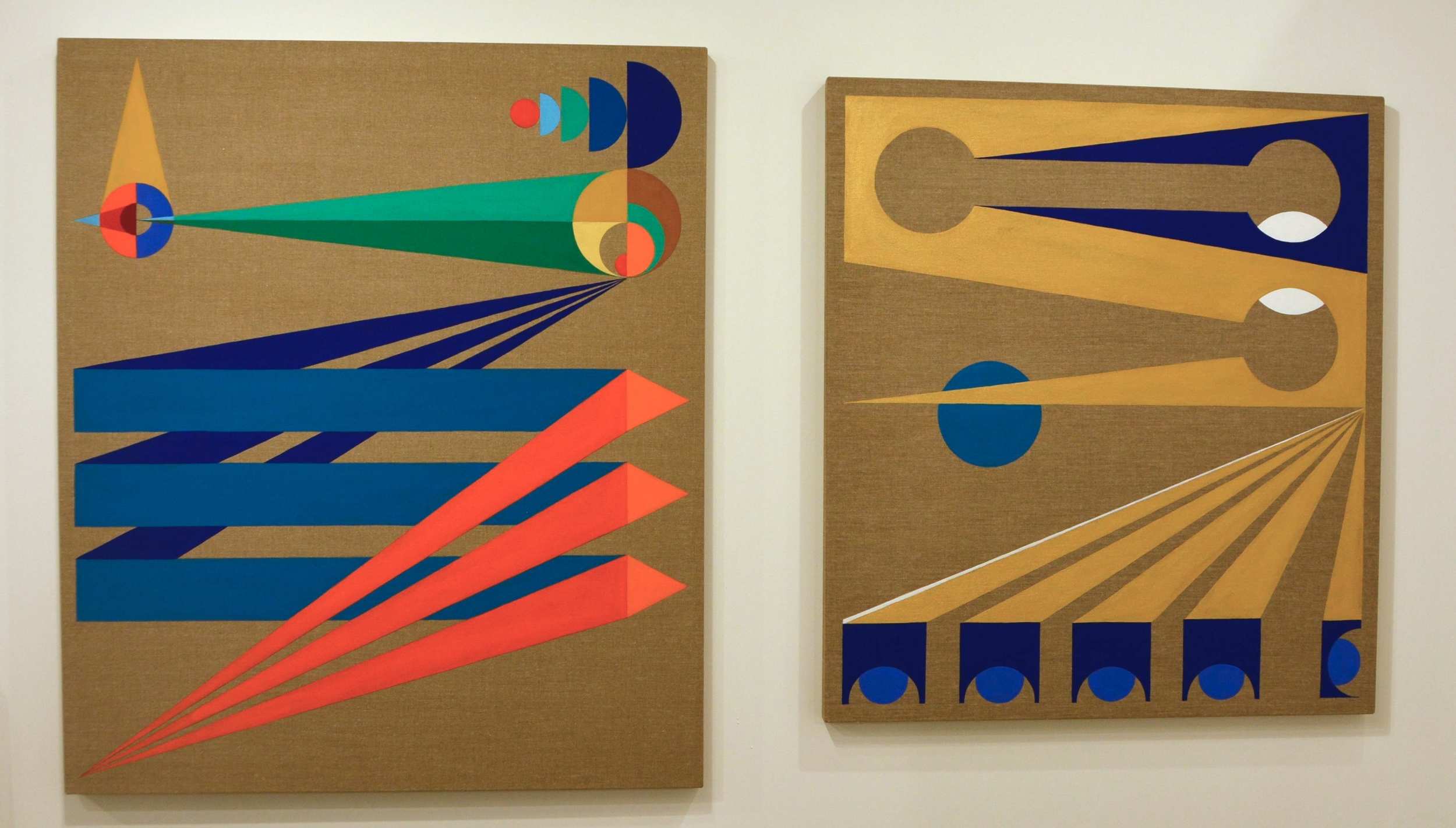
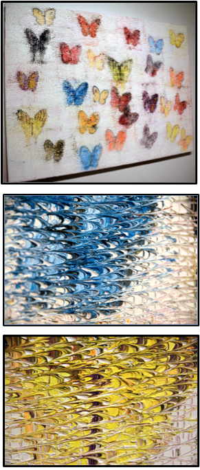
As I spent the afternoon walking through the galleries and snapping photographs, the necessity of experiencing contemporary art in person made itself readily apparent – as it always does. One just cannot get the full effect without being in the same room as the artwork, actually sharing the space and appreciating its scale, dimension, use of paint….the spectator has to engage with the result of all these factors. Photographs just don’t do justice.

Take this 36 x 48” oil on canvas by Madison Gallery- La Jolla, CA- artist Hunt Slonem called, “Morphos & Catelayas.” It looks interesting enough at first glance, but the surface texture and how Slonem has handled the paint changes everything. From afar it looks like the artist has tried to give the butterflies movement through line work and cross-hatching, but once the viewer gets closer to the piece they see the layering.

Slonem (American, b. 1951) is known for this technique in his portrait, butterfly, bunny rabbit and bird paintings. He creates the image and fills the entire canvas, building up layers of paint as he goes. Then, as the paint has started to dry and stiffen a bit, he uses the opposite end of the paintbrush to scratch and drag the paint.

The end result is a texture that keeps the eye moving across the work, following the lines of the grid and jumping from color to color. It captures light, creates shadow, and draws the viewer in.

Another work that caught my attention was a work by Emil Lukas (American, b. 1964). I saw the 32 x 26 x 3.5” piece when I walked into Hosfelt Gallery’s –San Francisco, CA -booth. It was on the back wall and it had a fuzzy, almost ghostly look to it. I couldn’t figure out what was going on. So, as good contemporary art does, it pulled me in.

It was thread! Silk thread woven over a painted wooden frame and held in place by nails. This engaging work, titled “Sound of Spinning, #1360,” comes from a series Lukas has been working on for over three years. He calls them thread paintings, and estimates he has probably used over a mile of thread on some works.

The work is a very interesting approach to surface. It is simple and impactful. Utilizing color theory and layering of the silk, the artist is able to give depth and create opacity. The webs of thread are kept dense at the edges and loose towards the center. The interior panel of wood is painted white and it shows through the silk. The end result is incredible. It tricks the eye and engages the audience to find out what is really going on.

Another set of work that attracted my attention was by Korean artist Seon-tae Hwang.

Again, it is hard to tell from images, but these things glow - literally. They are tempered glass, sandblast, and LEDs. The LEDs are behind the glass and they illuminate the works to emulate the sun. Rays of light reach in through windows and a broken roof; they cast long shadows and run over bright green plants. I saw these and knew they would get a glowing review from the audience….eh? Glowing…see that? It’s a pun cause they glow. Good art, bad jokes, moving on.

Another element that points to the Dallas Art Fair’s success and growing influence is the number of foreign exhibitors. This year they made up almost twenty percent of the galleries attending. Seon-tae Hwang is represented by GAMO Gallery in Seoul, Korea. The combination of great collectors, museums, overall atmosphere (we call it Southern charm) and quality artwork has allowed the fair to gain an influence that draws galleries like GAMO to attend.

Some more cool stuff:

A work by Carol Young, represented by Columbian gallery Beatriz Esguerra Art, is made to look like scrolls of paper, but the artist uses ceramic. I really wanted to pick one of these up. The pages are empty, but the detail of creases and folds are recorded. There is an interplay with the eye as you look at the stacked scrolls. They appear light and fragile, much like aged paper, but they have the strength and durability of ceramics. The installation pushes against the audience’s view of the material in front of them.

 Paul Villinski’s work, “Mirror IV” made from an Antique wood frame, aluminum from found cans, wire, steel and Flashe paint, is very engaging. The butterflies cast shadows onto the wall, each other and the frame, all of which is covered in a thick layer of Flashe paint. Flashe is a vinyl acrylic that dries very quickly and is matte; the finish resembling the powder pigment used by Anish Kapoor on many his sculptures.


Villinksi (American, b. 1960), represented by Morgan Lehman Gallery -New York - is a pilot and environmentalist, so imagery of flight and recycled materials are often found in his work.

These geometric Flashe on linen works by Eamon Ore-Giron (American, b.1973) of Et Al - San Francisco, CA - were interesting. The matte result of the Flashe paint on top of the shimmering raw linen makes the paint pop off the surface. This is enhanced by the use of bold shapes and bright colors coupled with the perspective play the artist employs through line.

The award for my favorite gallery at the show goes to Gallery Henoch of New York City. Henoch has some of the best contemporary painters who paint realism (hyperrealism, photorealism, superrealism) each putting their own spin on representational imagery. They represent some of my favorite working contemporary artists, the likes of Eric Zener, Robert Jackson, Steve Smulka, Janet Rickus and Steve Mill.

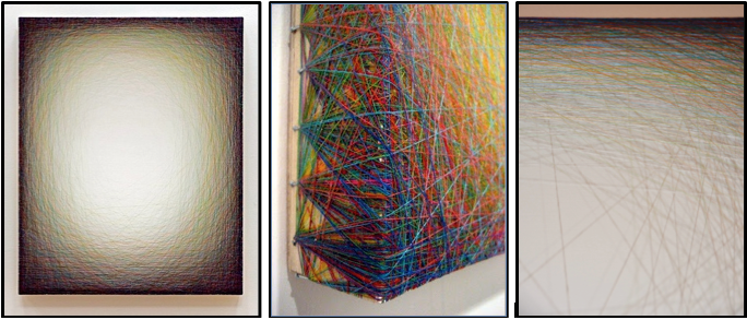
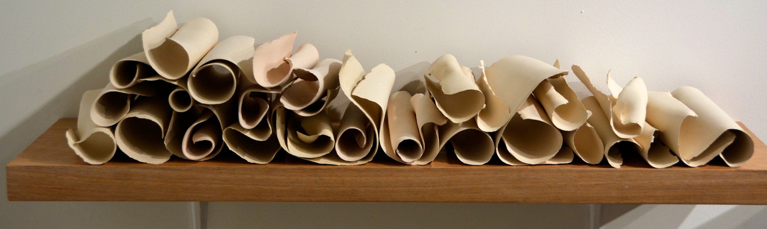
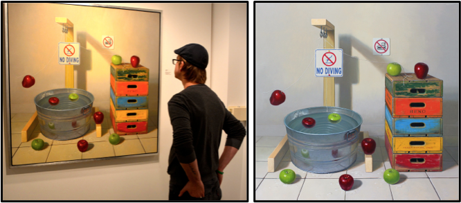
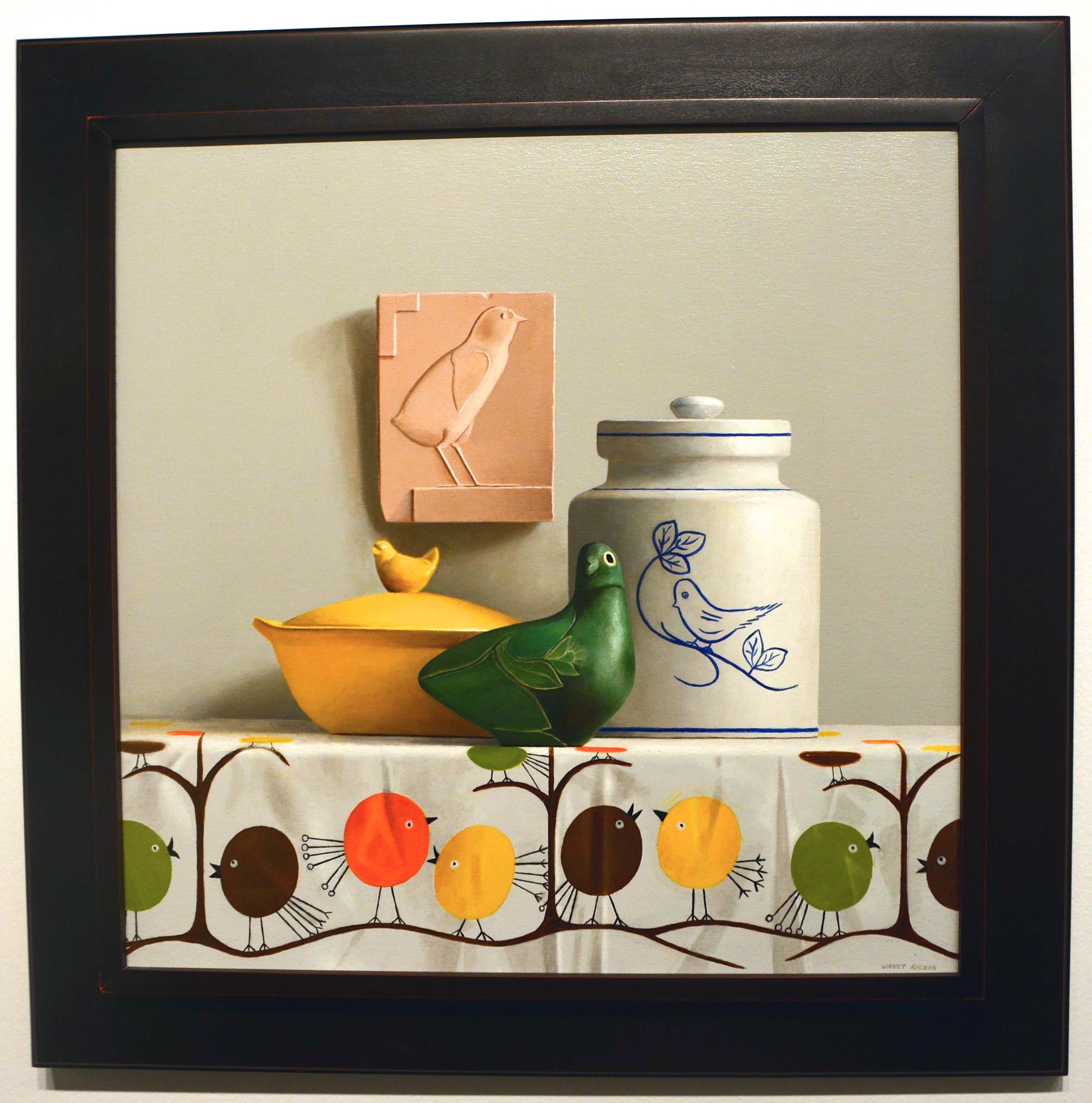
 Here is “A Bird Painting” by Janet Rickus (American, b. 1949) of Gallery Henoch.  Rickus paints realistic still life oil paintings, a lot of her work depicting fruit and vegetables in natural light.

The objects are painted to actual size and are placed atop table linens that cooperate with her subject matter’s color and form. She gives great attention to detail, whether tending to the soft shadow in a crease of the tablecloth or the smooth line of a jar; her work makes you want to reach in a pick up an item from the table.

I was pulled in by a 32 x 42” oil on linen by Steve Smulka. Because look at that thing… His play with light and reflection is great. This work “True Blue” has several glass containers huddled together. They are oversized and lean slightly toward the viewer, imposing on your space. His skill is evident in his treatment of the glass, but his works are all about the light. The light is what gives the work movement and life. The linen is almost monochromatic, saturated in blues and turquoise. By using deep blacks for cast shadows and bright white for reflection and light, Smulka transforms the glass; he makes it hyperreal, much more than just bottles.

This is Robert Jackson’s 48 x 49” oil on linen called “No Diving.” Jackson’s works are realistic, colorful and full of whimsy. He calls them contemporary still life works because his goal is to take the traditional ideas of a still life painting and bring them into the contemporary world; make them something new.   He takes inanimate, everyday objects and brings them to life. The objects, whether apples, balloon animals, or kids toys, are personified and become characters in a performance, usually with a dose of humor.

Nancy Whiteneck of Conduit Gallery standing next to Ted Larsen's salvaged metal sculpture, "Pure Evil"

Apples, for example, as used in “No Diving” and many of his paintings, have lots of symbolic meaning throughout art history - the sin of man, a forbidden fruit, a representation of knowledge, love…. When Jackson takes the apple, takes the symbol of the apple and all that goes with it, and places it in a whimsical painting, the result is exactly what the artist was going for. Something new. He also does this with his wooden crates. He has taken away the main prop in all of still life painting, the table, and replaced it with fun vintage sugar water crates.

This is the second year the Dallas Art Fair has coincided with Dallas Arts Week, and it wont be the last. In 2013 Mayor Mike Rawlings instituted the Dallas Arts Week to fall on the same week every year. It is a great citywide celebration of the arts; there were literally hundreds of events and venues for people to choose from this year.

As a city, Dallas is steadily growing its presence and reputation in the art world and the increasing success of the Dallas Art Fair is a large contributor. It was a fantastic show!

-M.P. Callender

The Dallas Art Fair – 2014!

The sixth annual Dallas Art Fair launches this weekend! Again, this year the Art Fair is located at the Fashion Industry Gallery at 1807 Ross Avenue.  With almost 70,000 square feet the Gallery is hosting over 90 prominent galleries and dealers, both national and international, all showcasing the finest modern and contemporary works from their artists and collections.

There is a Preview Gala Benefit, which starts on Thursday, April 10, benefiting the Dallas Museum of Art, Nasher Sculpture Center and Dallas Contemporary. Those who opt for the Preview Gala get the early bird opportunity to preview and purchase exhibited works prior to the public opening of the fair.

The Dallas Art Fair, with everything from paintings, prints, sculpture, photography, video and installations by modern and contemporary artists, is not the only thing happening in the Dallas Arts District this week – and this is no accident. Last year Mayor Mike Rawlings instituted the Dallas Arts Week (which started on the 5th and runs until the 13th) to fall on the same week every year, making this the second year for the citywide celebration of Dallas arts.  The week, “is designed to build awareness and appreciation for the cultural renaissance occurring in our city. The campaign will coincide with the ARTsPARK, Dallas Art Fair, DJAM (Dallas Jazz Appreciation Month) and Target Second Saturday, allowing the entire city to participate” according to their mission statement. Mayor Mike Rawlings is even scheduled to moderate a panel discussion on state of the Dallas Arts Scene on Tuesday the 8th.

There is so much to do in Dallas this week! Go for the sixth annual Dallas Art Fair and stay for Kylde Warren Park and the Dallas Museum of Art and the Nasher Sculpture Center and the Crow Collection of Asian Art and everything going on in Dallas Arts Week and...Ok, there might be too much going on this week to catch it all, so make your choices ahead of time. You can visit the Art & Seek website for a list of events to choose from.

Regular hours for the Dallas Art Fair start on Friday, April 11th.  The Fair will be open from 11am – 7pm on Friday and Saturday, and from Noon – 6pm on Sunday.  Day passes start at $25 and can be purchased at DallasArtFair.com.

This has been one of the best and most anticipated local contemporary shows of the year, don't miss it!

-M.P. Callender