art

Improving your Connoisseurship of Prints: Knowledge will make you a better collector

One of the more exciting and varied types of pieces that I am called on to appraise, buy and sell for clients is prints.  This is a broad category.  So that we are on the same page, let’s start with some definitions.

Print Defined

A print is a piece of paper on which an image is imprinted from a matrix.  With the exception of monoprints, print matrixes are created to produce several copies of the same image.  The matrix is a piece of wood, stone or metal on which the original image is created. This image can be created by an individual artist, a craftsmen working under the direction of the artist / studio director or, by photographic transfer.   Generally, those prints which are produced by photomechanical means are considered reproduction prints and are not collectible.

Prints fall into three general categories, defined by the type of matrix from which they are pulled.  The categories are relief, intaglio and planographic.  

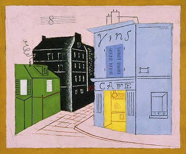
Relief: Woodcut, Linocut, Wood Engraving

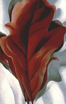
In a relief print, the image is transferred from the raised surface of the matrix.  The artist cuts away what he or she doesn’t want printed.  If you think about the potato prints you may have done in art classes or the rubber stamps you have played with, you will get the picture.  Within this category are woodcuts, linocuts and wood engravings.  (See Fig. 1 above)

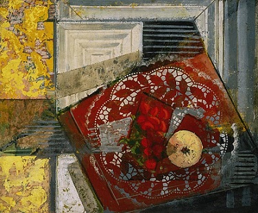
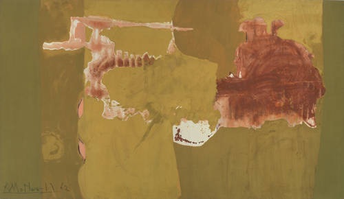
Intaglio: Engraving, Etching, Drypoint, Mezzotint, Aquatint

In an intaglio (pronounced ‘in-tall-e-o’) print, the lower surfaces, the recessed areas, are what transfer the image.  In this type of printmaking, the ink is applied across the plate, and the top surfaces are wiped clean. Damp paper is pulled through a high-impact press that forces the paper down into the recesses where the ink sits.  One easy way to spot an intaglio print is to look for the platemark, an indented outer edge left when the size of the plate is smaller than the size of the paper.  Within this category are engravings, etchings, drypoints, mezzotints and aquatints. (See Fig. 2 below)

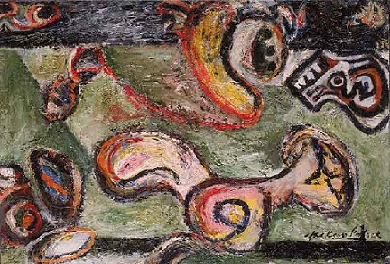
Planographic Lithograph, Serigraph: Reproduction print methods (halftone, xerography, collotype, photo-offset lithography, giclee)

As the name implies, planographic prints are created “at the plane” or surface of the paper.   The matrix for a lithograph is a thick Bavarian limestone.  The image is drawn onto the stone with a waxy substance and is chemically set into the stone.  The stone is inked and paper laid on it and pressed.  A stone will be used for hundreds of different prints.  After an edition is pulled, the image is ground off and the stone is ready to be used again. (See Fig. 3)

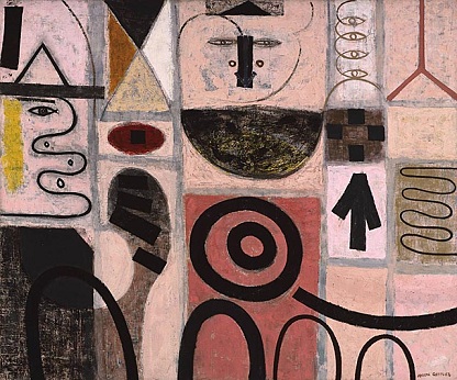
A serigraph (also called silk screen) is created with a screen or series of screens that sit just above the paper.  Each screen has the shape the artist wants printed in one color open and the rest of the screen blocked.  The artist puts the ink on the screen and pushes it through with a squeegee. Serigraphy is additive.  Each new screen adds another color, until the artist’s concept is complete. (See Fig. 4)

Most reproduction prints are photomechanical and are technically planographic since the plates are flat.  Most are not collectible. These are photomechanical reproductions of an artist’s work done in another medium. They are printed in very high quantities and are sold cheaply.   There is, however, a small group of prints in this category that have become collectible because of the popularity of the artist.  Even though the editions are high, a secondary (resale) market does exist for a few artist’s prints.  Some of the names that spring to mind are G. Harvey, Bev Doolittle, Robert Bateman and Paul Calle. When you run across an offset print and wonder whether the artist is collectible, it is easy to check the name and see if he/she falls into this category.

Spotting Reproductions

You will take a huge step forward in your connoisseurship of prints by learning to spot reproduction prints.   There are basically two types, photomechanical offset lithographs and a printing method developed in the 1990’s commonly called gicleé.   The first is easy to spot, and the second is a lot trickier.   Offset printing was developed in the early part of the 20th century.  This is the method of printing most high-volume, color printing that is done today.  The paper is usually flat, not much tooth, and somewhat glossy.   The image could be anything that can be photographed.   If the image looks like an oil but is on paper and is flat, you are looking at an offset print.   A simple tool, a jewelers’ loupe, will nail your identification.  Under magnification, you can see that these images are made up of a mechanical dot pattern of red, yellow, blue and black dots.   See Fig 5.

Gicleé is the latest addition to the printmaking methods.  It was developed as capacity for modern color ink-jet printers to print on larger, more varied surfaces combined with the increased memory capacity of computers. The added memory translates into the ability to transfer more pixels per square inch.  A pixel is basically a digital ‘image packet.’  When the pixel count per square inch is raised, the resolution of the image is raised.   In giclee printing, a digital image can be transferred directly from the computer’s memory onto whatever surface the inkjet printer can handle.  As the name inkjet implies, the color inks are blown directly onto the printing surface, producing a continuous tone similar to a photographic image.   In the mid-1990’s, these printers had developed the ability to print onto virtually any surface, metal, watercolor paper, canvas, etc.  Since the resolution is quite high on these prints, it can make them difficult for a novice to spot.   If you suspect from other clues that the piece might have been produced in the late 20th century, you must consider the possibility of gicleé.  Currently, gicleé printing is being used by most publishers of art for office environments.  It is also being used by some photographers and by computer graphics artists to print their work.  These prints can be printed on demand, meaning they do not have to be released in editions.  They can be printed at many different sizes and on quite varied surfaces.

So, why no Fig. 6? When viewed under magnification, there is no dot pattern to spot on a Gicleé print.  The pattern is a granular, all-over tone that is very close to the look of a photograph and some other printmaking forms.  These will be difficult for a novice to spot.  If you suspect gicleé printmaking, have a good print appraiser take a look.

Prejudice against prints?

So, there are the basics.  Now, I would like to discuss an odd phenomenon that I have noticed in the market —a real prejudice against prints among some dealers and collectors.  Since I am a print enthusiast, I have always found this attitude puzzling.  However, I understand some of the reasons that people shy away from prints.

Here’s the short list of objections and my responses to them:

  • An original painting is easy to spot and identify. Whether the painting turns out to be oil or acrylic, the value is not affected much by mis-identification of the medium.  But the term print is a broad category that covers everything from the collectible pieces on down to very inexpensive reproductions.  To say that an item is a print is only the beginning of categorizing the piece by its medium.   So, it takes more study time to properly identify prints.  Without some hands-on experience and a guide, many people are intimidated by prints.  It is true that becoming familiar with prints takes more time and study than other areas.  There are more mediums to become familiar with and be able to spot.  But, that’s also what makes the field intriguing.
  • Prints have been produced for many purposes and many different price ranges over the years.  One of the market niches that has been filled by prints is that of the inexpensive decorative item for the home.  With the advent of photomechanical printmaking in the late 19th and early 20th century, vast quantities of the same image can be easily and inexpensively reproduced.  The number of these cheap prints available far exceeds the number of collectible prints on the market and leaves a potential serious collector with the seemingly daunting task of separating the good from the bad.    Yes, there are lots of cheap prints out on the market.   But, there are also some incredible, collectible prints being offered at all levels of the market.    Armed with knowledge, a savvy collector can pick up great prints in resale markets like estate sales, auctions and the like for a fraction of their retail value.
  • Prints just aren’t worth enough money to bother with.  Paintings are where the money is.  This is a fallacy.   While it is true that when an artist works in more than one medium, the one-of-a-kind pieces will generally be priced higher than prints, the overall price range of prints is quite broad.   A good print from a young, local artist might start as low as a few hundred dollars.  On the other hand, a great print by a well-known master or contemporary artist might easily sell for $ 30,000-60,000, or more.

  • Condition is a major factor in the value of a given print.  Paper-born artwork is generally more fragile than paintings on canvas or panel.   And, collectors of prints can be very particular about condition.  So, it is just easier to look elsewhere.  Condition is important.  Print collectors like pieces as close to original condition as possible.  But, some damage can be corrected or minimized by a good paper conservationist. 

So, should you start or continue to build your print collection?  Are these pieces going to appreciate or languish in the market?  The answer is that well-chosen prints that are taken care of can be wonderful pieces of art that give you pleasure for years and can also be great investments.  How can we overcome the reticence to collect prints?  The short answer is knowledge.  The more you know about a given art medium the more fascinating you will find it and the better a collector you will become.

 By Brenda Simonson-Mohle, ISA CAPP SA_Logo_72dpi

Growth of the Dallas Arts District

The Dallas Arts District was created in early 2009 with a clear vision to stimulate cultural life and a three-point mission statement to serve the community as a private nonprofit organization.  The district itself spans over 68 acres and covers 19 blocks.  It is the largest arts district in the nation and Dallas is lucky to have a region with such creative vitality, luckier still as the region continues to grow. DSC_0100

The most recent additions to the district are Klyde Warren Park and the Perot Museum of Nature and Science.  The district is like a big neighborhood.  The Klyde Warren Park is the new finely manicured front lawn and the Perot Museum is the new neighbor who just moved in down the street.  These two additions to the district will stand next to the well-established and well-known surrounding organizations, including the Dallas Museum of Art, the Nasher Sculpture Center, the Crow Collection of Asian Art, the Dallas Opera at the Margot & Bill Winspear Opera House, the AT&T Performing Arts Center, the Dallas Symphony at the Morton H. Myerson Symphony Center and many more . . . 68 acres and 19 contiguous blocks more.

DSC_0121Klyde Warren Park opened on October 29th of this year and it, along with all the activities held there, is free.  You can bring your dogs and let them off the leash in the 'My Best Friend's Park' area.  While the dogs play, you can use the free WiFi as you walk under the shaded walkways to one of the many food trucks to grab a bite to eat.  The park has plans for a full Thomas Phifer-designed restaurant to open in the summer of 2013, but until then the food trucks will be at the park from 11 a.m. - 4 p. m.  Sit down at a table atop the huge lawn and send the kiddos off to the children's park while you eat and look at the park's many water features and let the Dallas traffic flow beneath you.  After eating, there is the 'Recreation and Games Courtyard' if you wanted a quiet spot to read.  Or you could sit at one of the tables set up with boards for checkers, backgammon and chess.  You can practice your putting at the green on the East Lawn or go over to The Commons for a game of foosball or ping pong.

DSC_0123

The 5.2 acre deck park was constructed over Woodall Rodgers Freeway between Pearl and St. Paul streets in downtown Dallas.  The park, built over the recessed eight-lane freeway, was designed by award-winning architect Jim Burnett.  All the landscaping, including 322 trees and 37 different species of native Texas plants, is an oasis of stillness surrounded by the bustle of downtown.  Though it is surrounded by tall glass buildings and steel-framed skyscrapers, the park is open to the Texas sky and full of vegetation.  It is a unique space in the heart of a special city.  Check the park's calendar to make sure you don't miss any of the daily events free to the public, ranging from concerts, films and lectures to boot camp, yoga and croquet.

Visible from the park, on the corner of  Woodall Rodgers and N. Field Street, is the Perot Museum of Nature and Science.  You can't miss it.  Really, it's the huge gray building with a 150 foot long glass rectangular prism running diagonally down its side.  This bold piece of modern architecture is 170 feet tall, which would usually lend room for a building with 14 floors- but the Perot has five, and is 180,000-square-feet total.  The walls are composed of over 650 textured concrete panels and the massive structure sits on a 4.7 acre site filled with indigenous Texas plants.  A full acre of the building's roof is covered in drought-resistant grasses and rocks that celebrate the museum's spot in the Lone Star State.

DSC_0031

The near-cube shaped building is more energy efficient than rectangular buildings and all its water demands are met by recapturing condensation from the air conditioner.   Solar-powered water heating and a rainwater collection system are just a couple of the museum's Green features.

The building itself, designed by Thom Mayne and his firm Morphosis Architects, is a stand-out even among the other fabulous facilities in the Arts District.  It is monumental and iconic, commanding a place among the other museums in the Dallas community.

The architecture on the exterior is just a glimpse of what is to come inside.  There are eleven permanent exhibition halls spread out over the five floors.  The main lobby, museum shop and cafe are admission-free, and there you can see the Malawisaurus dinosaur, use free public WiFi and see some "dancing" water molecules.  Admission is charged for the main exhibition spaces and for special exhibits.

DSC_0043

The encouraged, and best, route through the museum starts with three escalator rides up to the top floor, the final of these being within the glass-enclosed structure that gives the audience a great view of downtown.  Once at the top, you can then trickle down through the museum and catch each exhibition hall along the way.

As a Museum of Nature and Science, one can safely assume the normal museum protocol of 'hands behind your back - touch with your eyes only' can be left in the car to be utilized another time.  The Perot is extremely hands on.  In every one of the exhibition halls visitors are able and encouraged to engage with the exhibit.

In the T. Boone Pickens Life Then and Now Hall, where fossils and dinosaur skeletons fill the 11,000-square-foot space (most of which were unearthed in Texas and Alaska), you can handle fossil replicas in a fossil lab and solve ancient mysteries.  You can build your own virtual animal to fight in a videogame or watch video interviews with the scientists who discovered the fossils within the space at the push of a button.  Walk up a short flight of stairs and you will find the Rose Hall of Birds where you can put on a pair of 3-D glasses and stand in front of a flight simulator that lets you fly through the mountains as a bird just by tilting your arms, or hear a bird's call by pushing the button beneath each bird, even create your own virtual species of bird which you are able to name and then release into the wild.

purple

In each of the halls there is more than enough to do, you could happily spend the whole day there.  In the 2,200 square-foot Expanding Universe Hall you can take an animated 3-D tour of our solar system and use mirrors to bounce lasers at a target in the laser obstacle course.  In the Rees-Jones Foundation Dynamic Earth Hall you can make your own weather predictions and feel earthquake magnitudes in the Earthquake Shake.  In the Tom Hunt Energy Hall you can learn how a drilling rig works, see how scientists find energy reservoirs beneath the earth's crust and learn how science plays a crucial roll in every source of energy.  The Lyda Hill Gems and Minerals Hall was one of the highlights for me.  There is a five-foot tall rock that can be opened with a wheel to display the sparkling purple crystals of the gigantic geode.  In the low-lit gallery, all types and kinds of gems stand in cases.

In the Discovering Life Hall and the Being Human Hall you can crawl into an underground root system and explore the animals living under the Piney Woodlands or stand in front of a thermal camera to see the cold and warm spots of your body.

DSC_0069

There is a great piece by artist Daniel Rozin titled "Wooden Mirror" in which wooden tiles controlled by a motor and activated by a tiny camera interpret your image.

The motors tilt each tile so they catch the right amount of light to make a wooden reflection of what the camera sees; it makes a wooden mirror.  Rozin says the piece, "...explores the line between the digital and physical world using a warm and natural material- wood- to portray the abstract notion of digital pixels."

In the Texas Instruments Engineering and Innovation Hall you can play with chain reactions and use electronics to make music and create your own sound effects.  You can design your own robot or construct a building and test its strength against a simulated earthquake.

In the Sports Hall you can race a T-Rex or a cheetah and test your reaction speed by trying to catch a rod as it's dropped.  You can film yourself throwing a ball and watch the replay in slow-motion or learn how food choices balanced with physical activity benefits the human body.DSC_0079

The Moody Family Children's Museum was created for kiddos five and under.  This space lets toddlers and younger children explore just like the big kids.  They can use binoculars or put on a costume to become their favorite animal.  This Children's Museum has lots of other hands-on activities available: there is Digging For Dinos, an Art Lab and a Baby and Toddler Park where children can crawl in and around a huge nest, go down into a mole hole or just sit at one of the benches and have a P.B. & J for lunch.

The museum inspires curiosity in all ages.  As I made my way down from the top floor and observed every exhibition hall, adults were just as engaged as the kids.  They were taking their time to climb the musical stairs, sitting at computers and taking part in the experiments and interactive tools the museum has to offer.  This museum brings some amazing and unique family attractions to Dallas.

The Perot Museum of Nature and Science is open year round Monday through Saturday from 10 a.m. to 5 p.m. and Sunday from noon to 5 p.m.

DSC_0178

In addition to these two newest members of the Arts District, several of the other institutions have fresh offerings.  "Rediscoveries: Modes of Making in Modern Sculpture" is up and showing the masterworks from the Raymond and Patsy Nasher Collection; the DMA's show "Posters of Paris: Toulouse-Lautrec and His Contemporaries" which examines the complex French artist poster, is up and will be at the museum until January 20th; and at the AT&T Performing Arts Center the musical Jekyll and Hyde, starring Constantine Maroulis and Deborah Cox, is running from December 4th - 16th.

There is always something going on in the Dallas Arts District and the metroplex is fortunate to have men and women intently focused on the culture that, over the years, has created a hub with a dynamic and thriving community invested in the arts; privileged still as the region continues to grow.

-M.P. Callender Signet Art

SA_Logo.green

Searching the web for truth: Can art expertise be gleaned online?

Well, it happened again today... A family brought in a load of artwork they had been holding onto and storing for years, confident the pieces were worth keeping because they "just had" to be of some value.  After hours at the computer and a multitude of fruitless searches online, the family called us and made a verbal consultation appointment with our certified appraiser.  They had several pieces collected over the years from estate sales, garage sales and antique stores for our appraiser to inspect.storage

There were a few original paintings from the 1950's and the rest were offset lithographs.  The long and short of the consult- on a good day...if they could resell them for $40 apiece they should take it and run.  Several of the pieces had more value in the frame than the work itself. Ultimately these are what we put into the 'Decorative Only' category.  They are made in mass quantities to hang on the wall and look nice over the couch, maybe match the rug.

One piece in particular had pushed the couple to seek the professional insight of our appraiser.  "We found this exact one on the internet going for $13,000-$14,000.  It has the same markings and everything." The piece was an offset lithograph, a photomechanical reproduction of an original print. "But it has the same wording on the bottom, same exact title."  As with all good reproductions they are made to duplicate the original in every detail, which includes every mark on the piece; even the exact title.

Several months ago we had a client call and ask if our appraiser was qualified to handle French 18th century drawings.  I told him she was an expert in European and American art and would be capable of appraising his piece.  He then asked to speak to the appraiser himself, not convinced by her accreditations, résumé or 26 years as an appraiser.  For fifteen minutes he grilled the appraiser, shooting question after question to ensure his work would be in good and competent hands.  Turns out the client had done extensive research on his own...go figure.  He had done six weeks of research, the vast majority of it online, literally - he spent over a month and a half browsing the internet to find answers on what he had.  After all that time, after looking at images in books, and photocopies of the images in the books and photographs of the photocopies of the images in the books, he had convinced himself beyond any reasonable doubt that he had an original French 18th century drawing by Jean-Honoré Fragonard.  So, after interrogating our appraiser, he finally decided to make a verbal consultation appointment so a professional could confirm the truth of his "discovery."

It took our appraiser less than ten seconds to tell him he had a lithograph.

How he convinced himself of what a drawing versus a lithograph looked liked from a series of reproduced images was the "mystery" he never grasped.  He had wasted a tremendous amount of time and energy doing research, and in the process had built up an excitement that was dashed by the truth of what he actually had; a print.

The moral of these two stories, you must know the medium.  The medium.  The medium.  It starts with the medium.

Commonplace phrases we hear from clients go like this:

"I know it's old, it's been hanging in my Grandma's house for years" "Its got to be expensive, it's sooo old." "Must be valuable, it is an original." "But it's signed..." "Do you guys know who Insert random artist is?" "It has a beautiful gold frame, I just know its worth something."

The breakdown of these is: age ≠ value, a signature ≠ value, originality ≠ value and something being on canvas ≠ a painting, a piece on paper ≠ a print, and a gold frame does not mean its from a castle in the 17th century; seriously, if one more person tells me their piece has a gold frame...

3.14

Age ≠ value Just because something is old does not mean it is valuable.  Sure the possibility is there, but age is not a guarantee of value.  A client called last week and explained a painting in extreme detail, over the phone and said, "I bought it in 1985 for $1,500, so what would it be worth now?"  Its worth depends on a multitude of factors; medium, condition, size, subject matter and the ever important artist.  Works of art are not certificates of deposit slowly appreciating over time.  And something isn't necessarily old just because the painting was hanging in Gammie Baba's house for as long as you can remember.  Odds are Gammie Baba was born in the 20th century.

A signature ≠ value The signature is very important.  A beautiful unsigned still life painting might be valued at a few hundred dollars, but if it bears the name Renoir or Cezanne and can be legitimately attributed to one of those artists, the value drastically changes.  When doing an appraisal we look at many factors—medium, size, condition and date.  But among all the qualities which contribute to the value of a piece, attribution to a well-known artist is the most important factor.  However, not all signatures add value to a piece of art.  Some signatures are so illegible as to defy identification even after great amounts of research.  Some, dare I say the majority, are quite legible but do not trace back to a known artist.  Almost every family can point to a grandmother, aunt or uncle who took some art classes and produced dozens of pieces, each lovingly and prominently signed.  Though you love the paintings Gammie Baba painted for you when she took up art class, they fall under the 'Decorative' category; unless, of course, your grandmother was Grandma Moses...but that's another story.

Originality ≠ value Again, thinking back to your Gammie Baba's paintings and other works done by weekend-art-warriors, just because something is an original, the one and only authentic work or an original print, does not necessarily connotate value.  There is a huge market for original works, whether to be sold to tourists as souvenirs or as something nice to hang above the fireplace and bring the room together.  Again, among all the qualities that contribute to the value of a piece, attribution to a well-known artist is the most important factor.

Canvas ≠ painting : Paper ≠ print This is a common issue that fools new collectors or clients who have recently inherited or run into pieces about which they know very little.  They see canvas weave on their artwork and instantly think it is a real painting.  It has to be, right?  It is on canvas after all.  The truth is, canvas does not equal a painting.  It could be a gicleé, a print from a large-format, high-resolution digital image printed directly onto canvas.  The word gicleé actually comes from the French word gicleur which means nozzle.  Since the resolution is quite high on these prints, it can make them difficult for a novice to spot. Currently, gicleé printing is being used by most publishers of decor art for office environments. It is also being used by some photographers and by computer graphics artists to print their work.  A gicleé can be printed onto canvas, all types of papers, woods, metals, glass...whatever the client wants. These prints can be printed on demand, meaning they do not have to be released in editions. If you suspect gicleé printmaking, you need to have a good print appraiser take a look.

Image

It could also be a print-transfer-to-canvas.  Prior to the introduction of gicleé printing in the mid-1990's, manufacturers of decor items might take an offset lithograph and glue it to canvas in order to simulate the look of a painting.  These products were often covered-over with a swirly clear acrylic coating in an attempt to simulate an artist's brushstrokes.  These are just two of the types of items which might at first appear to be original paintings but are in reality mass-produced decor items.

Gold frame ≠ value I PROMISE.

This all boils down to clients and art enthusiasts not knowing the whatof what they have.  The internet is thought to have all the information ready and available; just go to that search bar and you're set.  In ten, maybe twenty minutes, you will be an expert, right?  Right?

Wrong.

Expertise in the art world is built upon years of training and experience.  A good appraiser has many years of book-knowledge about their given field along with many more years of handling and looking at actual artworks and time spent doing research.

The family I mentioned at the beginning of the post asked the appraiser why the two originals they had were not worth more than $40.  Our appraiser, who had not lifted the works up from the examination table, said, "Well they are 1950's oil on silk tourist works from Japan, probably brought back with a soldier from duty after WWII.  They are nice and decorative, they serve their purpose as art, but don't have a secondary market."  The client's eyes widened in surprise, then she asked, "How did you know it was from 1950?" as she picked up the work and showed the hand-written inscription, 'Japan, 1951' on the back.  Our appraiser explained that in the 26 years of professional appraising, she's seen hundreds of similar items.  To a novice, it was a very nice original oil on silk from the 50's. To the eye of our trained and seasoned professional, it was another Japanese tourist painting.

The lessons to be learned here...If you do not know the what of what you have and you turn to the world-wide-web for answers, your online searching will be an effort it futility, a huge waste of time.

So, by all means get out there.  Collect art.  Go to estate sales, garage sales and auctions.  Find what you like and have fun.  Build your connoisseurship as you go.  Look at art.  Ask a professional to teach you what to look for.  Art-world terminology can be confusing.  Sometimes that is just because of the nuances of language, and other times unscrupulous dealers use opaque, misleading and untrue descriptions to defraud the buying public.

When you need the services of a good appraiser, either for a written appraisal or a verbal consultation, remember that the money you pay for an objective well-trained appraiser to tell you the truth about your artworks is money well spent.  Not all knowledge is free or available on the web.

-M.P. Callender

Signet Art

To See As Artists See: American Art from The Phillips Collection

ImageThe current exhibition at the Amon Carter Museum, “To See As Artists See, American Art from The Phillips Collection” is one of the best shows to come to Texas this year.  With over 100 fantastic works of American art, the exhibition investigates the progress of modern art in the United States from 1850 through the 1960’s.  Divided into ten sections the spectator is taken through a showcase of exceptional works from artists who, as the Amon aptly put it, “found their own voices and created deeply personal work born out of the great traditions of the past.”

Duncan Phillips, whose father was a Pittsburg businessman and grandfather was co-founder of Jones and Laughlin steelworks, graduated from Yale in 1908 along with his brother, Jim, with whom he was very close.  The two brothers shared a love for the art world and collected together for many years, eventually they were even given a collecting allowance from their parents.  Duncan studied and wrote about art, publishing his first book, "The Enchantment of Art", in 1914.  The death of his father in 1917 and Jim's death from influenza in 1918, shocked and overwhelmed Duncan.  As a response to the family's loss Duncan and his mother founded The Phillips Collection in Washington, D.C. in 1918, originally called The Phillips Memorial Art Gallery, and in 1921 opened it to the public, effectively making it the first museum of modern art in America.

"To See as Artists See,"  is the first international touring exhibition by The Phillips Collection to showcase the museum's distinguished collection of prominent American works.  Amon G. Carter Sr., like Phillips, was a passionate collector.  This is evidenced through the many canvases and bronzes within the walls of the Amon that express Carter's enthusiasm for American art, particularly art of the American West.  There is no better museum to exhibit these extraordinary works from the Phillips Collection than the Amon Carter, a museum devoted soley to American Art, and this outstanding collection of our nation’s art history is here through January.

Beginning with the section titled “Romanticism and Realism”, the exhibition presents the viewer with realistic, moving landscapes and narrative scenes by artists such as George Innes and Thomas Eakins.  This sets the tone for the timeline-driven show as the 18th century American artists melded realism with the romantic in the years following the Civil War.  As a progression away from the everyday scenes of common American genre painting, working artists in the states sought to portray another level within their work that gave insight to man’s interaction with nature.  Instead of intense realism that distinguished landscape painting historically, the movement set out to impact the individual by expressing a new vision which targeted emotion and the thought process of the viewer.

Image

Winslow Homer’s oil on canvas “To the Rescue,” executed in 1886, is a great example on display in this section as the work gives sparse narrative and direction, avoiding the painting’s unseen subject of a shipwreck rescue mission and, instead, focuses on three figures hurrying to the scene of the tragedy.  There is an intense drama and urgency of the event expressed only by the troubled movement of a man in the lower foreground as he approaches two women along a stretch of beach.  The canvas is rendered with a limited color scheme of tonal values and is concerned with sketchy and simplified aesthetics meant more to evoke and impact the viewer rather than tell a story.  In a later painting, Homer returns to this shipwreck subject and gives the figures on the beach context; the tragic accident is displayed for the viewer.

In the second section “Impressionism” American art collides with the French impressionist style.  This new analysis of the city and countryside brought forth bright depictions of relaxing scenes and cityscapes that were the favorite subject matter of artists like Childe Hassam and John Henry Twachtman.  With a light color pallete and quick brushstrokes to give a sense of reflection and atmosphere, American artists with training from the art academies of Europe transformed French impressionism into a decidedly American movement.

Image

Maurice Prendergast's 1917 oil on canvas, "Fantasy," with thick brushstrokes and splotches of color, presents the viewer with a space of imagination as a crowd of faceless people gather in a forested landscape near a bay with a singular moored sailboat.  Prendergast's approach to the canvas with subdued colors and intricate patterns that run along the surface has great allure, pulling the viewer in, inviting the viewer to investigate the arrangement of dots and patches of varied hues that enliven the quiet, leisurely composition.

In the section "Forces of Nature" with works by John Martin, Marsden Hartley and Harold Weston, the audience is given warm depictions and a soft visual language of the landscape as the artists found an escape from the everyday civilization where they sought to experience the intensity of nature, particularly in the landscapes and climate of northern New England.  The American landscape painters after the turn of the century were dissatisfied, or even bored, with Impressionism’s focus on the intimate landscape views rendered in soft, bright tones.  Instead they chose to depict the modernist impulse.

Two works by Rockwell Kent stood out in this section, "The Road Roller" and "Azopardo River."  In "The Road Roller," a drama builds between the artist's fluid brushstroke and thick impasto as he depicts a crew from the Dublin Township packing down the snow of his driveway.  With long shadows reaching out across the snow towards the viewer and thick clouds crowding the sky, there is more happening than snow being packed for ease of travel.  There is a boldness which transcends the scene.

"Azopardo River" is a view across the undulating waters of the Azopardo River in Isla Grande de Tierra del Fuego, Chile at the southern tip of South America that displays rocky mountains beneath a blue and clouded sky.

These two pieces by Kent have great, intentional conversation as they are situated very close to one another within the exhibition.  They communicate and correspond, at times in agreement with one another as they work together with a similar overall color scheme of white, blues and grays and a drama obtained through shadow and scale.  Conversely, they disagree and compete as the Azopardo landscape is serene and calm, almost overwhelmingly still.  It has browns, reds, oranges and pastel greens that smooth over a range of mountains retreating into the distance.  The river encompasses the foreground and is tranquil with subtle ripples and small waves spreading across its surface as it sits under soft white clouds.  "Azopardo River" has a warmth, while "The Road Roller" is sharp and has a biting cold with silhouetted horses toiling at the reigns of men oblivious to the viewer.

This section transitions into "Nature and Abstraction".  The 20th century American artists in this section sought to deconstruct nature in such a way to obtain a connection, to portray a sensory experience that would evoke a personal response with the viewer.  Works like Georgia O'Keefe's "Ranchos Church" and Arthur Dove's "Morning Sun" explore the notion that the natural world's emotional impact and spiritual 'feel' could be rendered and communicated through color, line and form without the crutch of representationalism.

Image

O'Keefe's oil on canvas "Large Dark Red Leaves on White" (1925) depicts red leaves that are magnified and slightly cropped to fill the canvas. By limiting the viewer’s focus to the form of one leaf  and enlarging that to fill the image, O’Keefe takes us away from our pre-conceived notions of landscape and forces us to focus on just the folds and turns of one leaf.  This allows us to see the sensual beauty of the individual.  This work is a glimpse of the dramatic and sexually-charged paintings O'Keefe is best known for.  She uses abstraction as a way to express intense emotion by transforming the lines and colors of the objective form, the red leaves, into an abstract composition.  The bright white tones and silver hues of the background contrast with the dark reds of the main leaf, creating an unclear sense of space. O'Keefe's paintings exemplify the expressive symbolism artists wrestled with as they continued to define American modernity.

American Impressionists avoided depictions of the urbanization that occurred at the end of the 19th century.  As industry and the rise of the modern city challenged the identity of the nation that was established and time-honored as an agrarian society, artists like Walt Kuhn, Edward Hopper and Robert Henri combated the mannerly social world of uptown New York.  Instead they set out to depict subjects of everyday life in the working-class, they wanted to show the grit.  These urban realists were coined the "Ashcan School" due to the subjects they painted - poor neighborhoods, fortune tellers, slum dwellers, alleyways and the like.

At the end of World War I, the city had become a powerful symbol for America.  Skyscrapers shot up into the skyline, bridges reached across rivers and the new construction and energy of urban America stood firm as a sign of the nation's growth.  With culture embracing advanced technology and engineering, the city began to replace the countryside and artists began to explore America's industrial landscape.  Edward Hopper, John Sloan, Charles Sheeler and others approached the city as something alive, an entity with a thriving pulse of its own.

In the sections "Modern Life" and "The City", the works of Edward Hopper and Ralston Crawford encapsulate this period in American Art.  The works "Sunday" and "Approaching the City" by Hopper are sharp and tough; they are truthful.  The artist gives you the essentials of the scene.

Image

In "Sunday" a solitary man sits on a sun-washed curb completely oblivious to the viewer.  It is a flat portrayal with no drama, no energy.  The audience is in question, What is the man waiting for? Who is he? Does he own one of the shops? Is business closed on Sunday? The 29 x 34" oil on canvas has the smooth, solitary feel characteristic of Hopper's mature style.  It is a blend of pleasure and depression.

Image

"Approaching the City" is an almost stoic moment of the commonplace.  It shows a wide angle view of train tracks and an underpass.  A thick concrete wall runs parallel with the tracks and separates the foreground from apartment buildings in the distance, lending a sense of isolation.

In this modern city, Hopper has used a dull color scheme.  As with "Sunday", there are no bursts of color to illicit excitement or convey energy.  Instead, tan, sanguine, gray and white are used to create a space of curiosity and uncertainty.  Amongst all the buildings in the background filled with windows, there is not a soul in sight.  "Approaching a City" is Hopper painting the loneliness of the modern city, he is commenting on the sense of being on our own in the world, being on our own in the human condition.  It is the vantage point of the stranger.

It posits the question of the railroad's role in contemporary life.  The railroad made travel possible and shrunk the world, it made distant destinations accessible to the commoner, but it also made those places less distinctive.

Image

Ralston Crawford's 20 x 16" oil on canvas "Boat and Grain Elevators, No. 2" idealized the industrial landscape.  It is a view of three grain elevators side by side with a merchant steamer in the background.  The work is very two-dimensional.  Crawford has simplified most of the elements in the painting down to wide, clean geometric blocks of color.  This flat handling of both architecture and nature continued to progress throughout the artists career, his later works grew fragmented and disorganized.  Like the works of Hopper, there is a connection with the viewer, a commentary happening, but it is not dramatic or of passion.  It is stagnant and anonymous.

The “Memory and Identity” section of the show explores America in the early part of the 20th century as it began to acknowledge and celebrate the cultural differences of various regions and ethnicities.  The great northward migration of African-Americans seeking work after the Civil War created large urban black populations in a few northeastern cities such as New York and Chicago. This was the era of the Harlem Renaissance in New York City.  This show includes paintings by Horace Pippin and Jacob Lawrence which explore the day-to-day lives of their own African-American communities.  These artists dealt head-on with the complexities, hardships and joys of life in their communities.   Jacob Lawrence’s tempera painting series “The Great Migration” was an intensely personal subject for Lawrence as his own family migrated from North Carolina, through Virginia, to New York City.  The works in this series are dynamic and angular, flattened and graphic in keeping with a more modern approach to figure painting.  The figures in Lawrence’s paintings are less representations of individuals than depictions of the struggles of the collective, the “every-man.”  The show also includes paintings by Grandma Moses, the self-taught regionalist artist who felt compelled to do paintings of her life in rural America.   This is a view of rural, white America that stands in direct contrast to the depictions of urban black America hanging in the same room.  The Phillips viewed these pieces as essential reflections of the country’s growth and ethnic diversity.

The famous Armory Show came to New York in 1913 and introduced American audiences to the cubist works of Pablo Picasso, Georges Braque and Marcel Duchamp and other European artists for the first time.  While many critics ridiculed cubism, a group of American artists were gripped by the elements of it and embraced the style.  By the 1920's the multiple viewpoints, fractured forms, bold line and flattened spaces that exemplified cubism began to surface in the works of numerous American artists.

Image

These American modernists, such as John Graham, Karl Knaths and Niles Spencer set out to interpret and personalize cubism by filtering it through a decidedly American lens.  They integrated the elements of cubism into their own unique abstract styles.  This can be clearly seen in the landscape depictions by Stuart Davis.  The 18 x 21" oil on canvas "Blue Cafe"  is rendered in flat simplicity with bright, vibrant colors.  The streets are flattened and the buildings are reduced into geometric blocks within the two-dimensional plane.  Even the puffs of smoke exiting a chimney are reduced to stiff squiggly lines.

Image

As Davis took the cubist approach to the landscape, Alfred Maurer took it to the still life in his 17 x 21" oil on hardboard "Still life with Doily".  This work, though dark and muddy with deep reds and browns, has a whimsical feel added by the detailed white doily.  This is an American modernist embracing European modernism as he allows cubist influences to interpret his environment, in this case a still life with strawberries and an orange on a white doily.

The last two sections of the exhibition cover the 1940-50's move into abstraction.  The abstract expressionist works held in the Phillips collection are some of the earliest glimpses into the visual language and avant-garde artistic activity that made New York the capital of the art world in the 1940s and 50s.  Whether taken from the shapes within nature or the influences of the psyche, American artists pushed abstraction to obtain a language of unadulterated color and form.  In the section "Transition to Abstract Expressionism" works by Jackson Pollock, Alexander Calder and Arthur Dove show the movement as is finds its bearing and begins to take shape.  The early works by Pollock and Gottlieb show great insight to the viewer as they see the artists experimenting on the canvas.

Image

The 17 x 25" oil on canvas "Composition" by Pollock is not one of the drip paintings for which he is best known for.  It is a tangible display of Pollock transforming his previous figurative language into one comprised wholly of non-representational forms and gestures.  He believed that emotion and abstraction were connected, and this belief fueled his progress to large scale action paintings.

Image

Likewise, the massive 59 x 71" oil on canvas "The Seer" by Adolph Gottlieb is an early work for the artist. Gottlieb painted a large number of works utilizing cryptic symbols which resembled the pictograph writing of ancient cultures.  This use of semiotics was his solution to show meaning through abstraction without referencing actual objects, moments in time or places.

In the final section, "Abstract Impressionism" the viewer encounters works by the big hitters of the movement; Robert Motherwell, Mark Rothko, Clyfford Still, Helen Frankenthaler and others.  These works are presented as firm examples of the Abstract Expressionist movement by artists who solved, as they described it, the "crisis of subject matter".  The search for subject matter led to the questioning of meaning.  This led to an intense internal dialog as the abstract expressionists looked within and explored their psyches of inspiration to transfer to the canvas.  Painting became a means of expressing emotions and ideas onto the canvas; to give feelings and thoughts tangibility.

Image

Robert Motherwell's massive 82 x 141 oil on canvas "Chi Ama, Crede" shows for the viewer how the artist sought to create imagery which communicated emotional truths.  The painting's imposing size contributes greatly to its emotional impact.

Image

There is an early work by Richard Diebenkorn on display titled "Girl with Plant."  This piece  is from Diebenkorn's figurative period and gives the audience a preview of the later, and more well known works by the artist; the pieces from his Ocean Park Series.  In the 80 x 69" oil on canvas, it really isn't a portrayal of a girl in a room with a plant.  Instead, the sitter, who faces away from the spectator, is absorbed into the composition, she becomes a part of it.  The space seems to be transitioning, slowly becoming more and more flat.  On the right side of the canvas is an area dominated by three rectangles.  This layering of simplified shape and blocks of color points to the artist's development of expression later seen in his Ocean Park pieces.

This last section also includes two Alexander Calder mobiles.

"To See as Artists See: American Art from The Phillips Collection" is a great opportunity to see highlights of the Phillips Collection while building is underway at the Washington, D.C. facility.  The Amon Carter is one of only three U.S. museums that will be hosting the exhibition; the show has already been to Italy, Tokyo and Madrid.  The show opened October 6th and will be running through January 6th of 2013.

Incredible show, great museum, absolutely free. You officially have no excuses.

-M.P.Callender Signet Art

Image